
The Only Price Action Trading Guide You Need To Read
Price action trading is without a doubt the most popular trading concept.
Thanks to its relative simplicity, most traders end up running different varieties of price action trading strategies in their careers.
Different indicators accompany some; some are just naked price action charts.
This raises one obvious question.
Can be trading solely a price action a profitable way to tackle financial markets?
This is what we will cover in this article, but not only that.
I will explain the most important price dynamics and, more importantly, how and why markets are moving.
If you like this article, read the rest of the blog or join the Tradingriot Bootcamp for a comprehensive video course, access to private discord and regular updates.
Video version of the article.
What won’t be covered in this article
If this is not your first visit to this blog, you might already know I don’t like to bother with basic things.
Internet is full of beginner trading education, and because of that, I won’t be explaining the fundamental basics of price action.
In other guides, in this blog, I tried to do my best to explain all the basics so everyone could understand, but this article would mean covering Japanese candlesticks, what support and resistance is, and so on.
If you lack this knowledge, there are websites such as Babypips or Investopedia where you find plenty of resources to fill this gap.
My only recommendation for you be, don’t ever pay to learn the trading basics; some people sell the most simple knowledge for hundreds of dollars which is a waste of money as you can learn it for free.
Price is fractal
The first rule everyone who is trading price action should understand that price is fractal.
But what does that actually means?
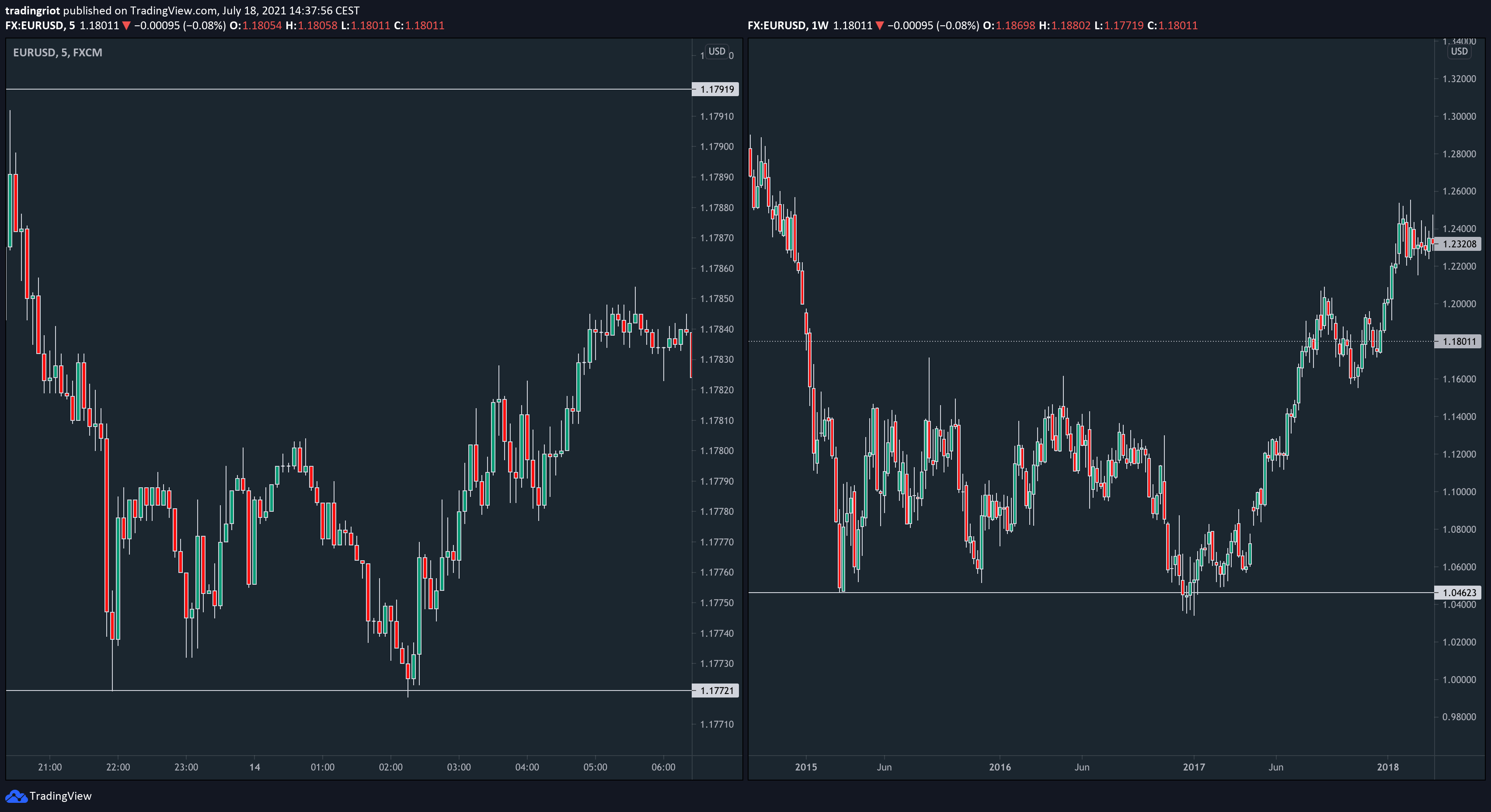
The chart above shows two very similar scenarios.
Market, in this case, EUR/USD, sold off, established support and rallied up after an unsuccessful attempt to break lower.
The main reason is that on the left chart, it took approximately 10 hours from the first support test to unsuccessful probe lower and rallied higher as we are looking at 5-minute timeframe candlestick chart.
We have a weekly timeframe chart on the right side, and the whole move took over 2 years to play out.
Every time you see different charts on the internet, you cannot tell the specific timeframe if you don’t study the given market closely.

The lesson in all of this is to understand that the fractal nature of the market tells us that the market dynamics and how moves initiate/end is the same across all timeframes.
Monthly trends can be spotted in advance on a weekly chart, same as hourly trends can be spotted on the 5-minute chart.
This alone should explain why the “lower timeframes are just noise, don’t bother looking at them” statement many educators use is nonsense.
Trading on the 5-minute chart is, in essence, the same as trading on the daily chart; the only difference is that more people watch higher timeframe levels; therefore, they attract much more attention and liquidity compared to lower timeframe support that gets completely irrelevant within few hours.
That is why lower timeframe levels can get less respected as only short term traders around them.
Although this is not an article about what trading approach you should choose, I wrote about that in my Swing vs Day Trading article; if we once again take a look at 5-minute vs Weekly timeframe example above, personally, I’d rather get a little more back, and forth market on the 5-minute chart than waiting months/years for one trading idea play out.
Sitting in positions for months/years is something large players can afford, but this is not the best way for most retail traders who want to participate in the market actively.
On top of that i’d also argue that you are more likely to predict market movement in the next hours/days than be able to say what will happen a year from now solely based on the price action chart.
To drive this point home, take a look at the example above, which is a prime example of the fractal nature of price.
Of course, you will need much more than spot price behaviours for actual trading, but work on multiple timeframes and decompose charts to smaller timeframes while keeping your high timeframe levels/ideas in mind can generate highly EV+ trades.
Market Structure and environments
Another thing that very often trips a lot of traders is that they cannot recognize proper market environments or adapt quickly enough for structural changes.
Over the year, there were many theories about the market structure and different nuances; there is a Wyckoff, Dow Theory, Elliot Waves, etc.
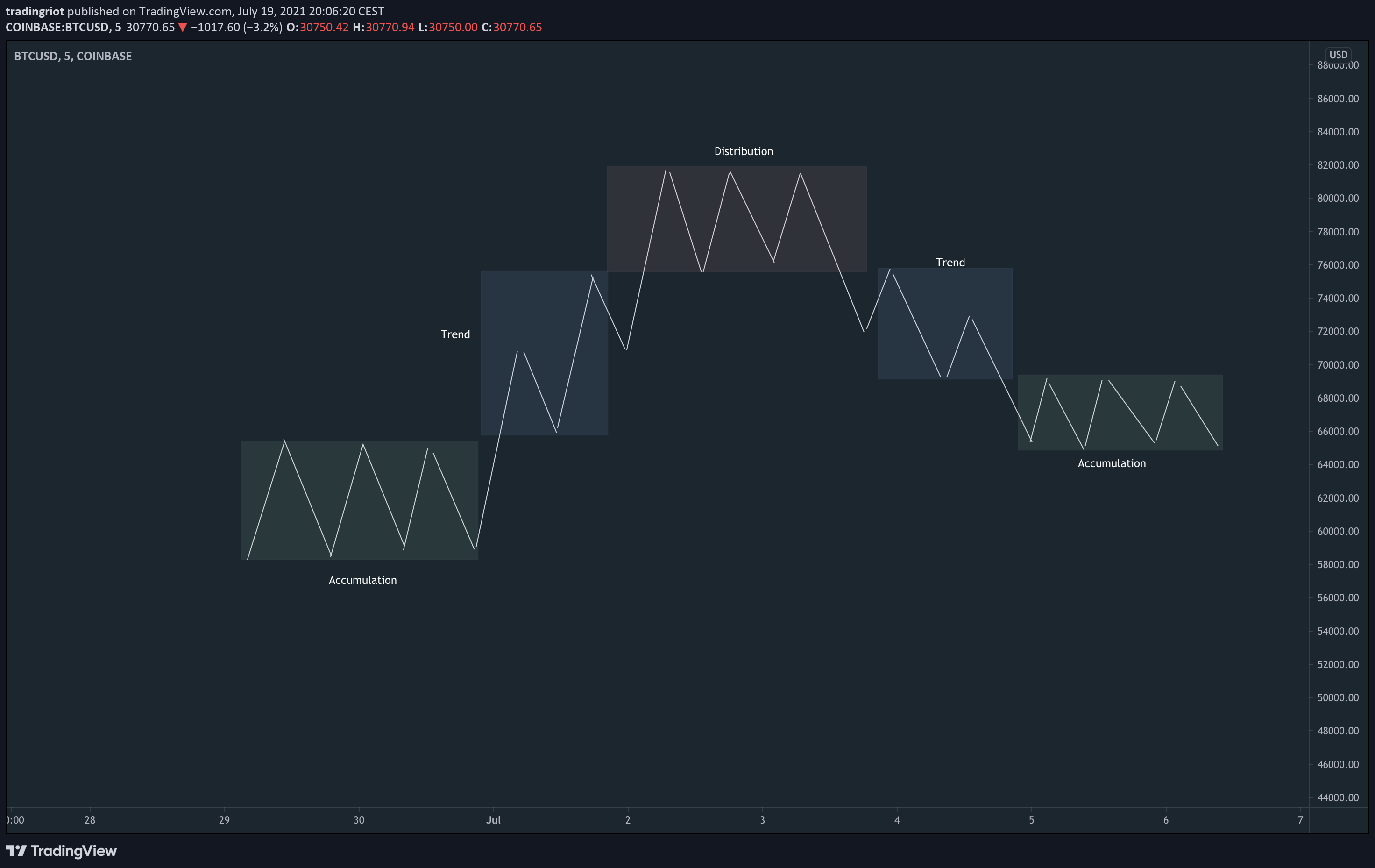
Before I get caught up by some Dow specialists, this is just a simple graphic of how markets move.
Similar to Auction Market Theory, markets are trending until they find an acceptance; that’s when they form accumulation or distributions before another trending leg.
These accumulations and distributions are often seen in simple price action patterns such as head and shoulders or wedges.
Although these classical charting patterns are often branded as “retail, non-working things”, people don’t understand they have to place them in the right concepts.

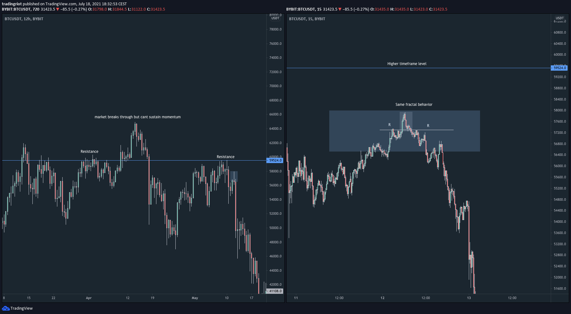
As you can notice on the chart above, Bitcoin was in a strong, almost parabolic trend at the start of 2021.
Once momentum dried down, distribution was formed.
The most important thing and the signs of weakness, which should be a strong signal for every price action trader that the market is about to head lower, is losing a market structure.
When markets trend, you can see different legs that produce new highs/lows.
Once these legs get broken, you can see a shift in a market structure.

This concept is extremely simple, and you will find it in probably every basic price action book.
For this reason, I think a lot of people tend to ignore it, or they don’t bother with understanding the basic market structure and trading environments.
If you think I just cherry-picked the current Bitcoin top to fit the narrative for the article, have a look at the 2018 Bitcoin top.

Of course, as the price is fractal, you will have these shifts happening many times during the day or the week.
That’s where your trading system comes in, as you need to define rules and patterns for your entries as exits.

We dialled down from Daily and H12 Bitcoin charts to 30-minute Gold charts, yet they look almost identical.
These mean reversal trades belong to one of my favourite patterns to trade, and I talk in-depth about them in the Trading Blueprint.
One of the last things I want to mention about market structure and environment is how important it is to recognize in what market you are currently in.
In trending markets, things are generally easier as markets usually print a clean market structure, or you can use simple indicators such as moving averages to avoid counter trading.
In ranging markets, things can get tricky where many people tend to anticipate breakouts in situations where markets are much more likely to reverse.
Because of that, be mindful of your trading ranges. You can use simple price action, indicators such as Bollinger Bands, or my personal favourite Volume and Market profiles.

Specific timeframes are not relevant.
Now that we covered the fractal nature of the markets and how markets move, there is one interesting concept I see on the internet, which is putting high importance on the timeframes.
Conventional wisdom always mentioned popular timeframes such as Daily, H4, H1, 15min or 5m.
These are also the timeframes you will find as the default choices in most retail trading platforms.
But does it really matter if you look at a 4-hour or 3-hour chart?
Not really.
If we look at this H4 chart of Gold, you might have a trading idea of buying rejection at previous support lows.
Looking at this chart alone, nothing is screaming at you to buy these prior lows; H4 candles do not show any convincing rejection, and then the price moves up.
Now have a look at the H3 chart, which paints quite a different picture.
3-hour candles putting some rejection wicks at the low might give you a much higher conviction of stepping into the long position.
So what actually is important here?
It is all about what was already mentioned.
The market structure on lower timeframes and accumulation at the lows would give you the best clue.

On 15 minute chart, you can see a clean distribution pattern at the lows and an eventual shift in market structure that confirmed the move to the upside.
From this example, you can clearly see that it does not matter if you decide to watch markets on 240, 200 or 180-minute charts.
It is all about the fractal nature of price and spot reversal that happens on lower timeframes, but once again, the market structure shift happened the same way on 15 minutes, 10 minute or 12-minute charts.
Liquidity
Liquidity is another important concept you should understand in trading.
Over the years, it became a large buzzword in the trading world as it is being marketed by most people selling courses as a “secret” way to profit from retail traders.
The truth is that most people who use this term have very little idea what liquidity actually is.

The picture above shows trading DOM; liquidity is displayed in the red and blue columns.
They are the resting orders in the market waiting to get filled.
So, where can you find liquidity?
The most resting orders are around prior day/week high/low, key higher timeframe swing points, around round numbers, and price points mentioned by financial media like Bloomberg and so on.
Why is this important?

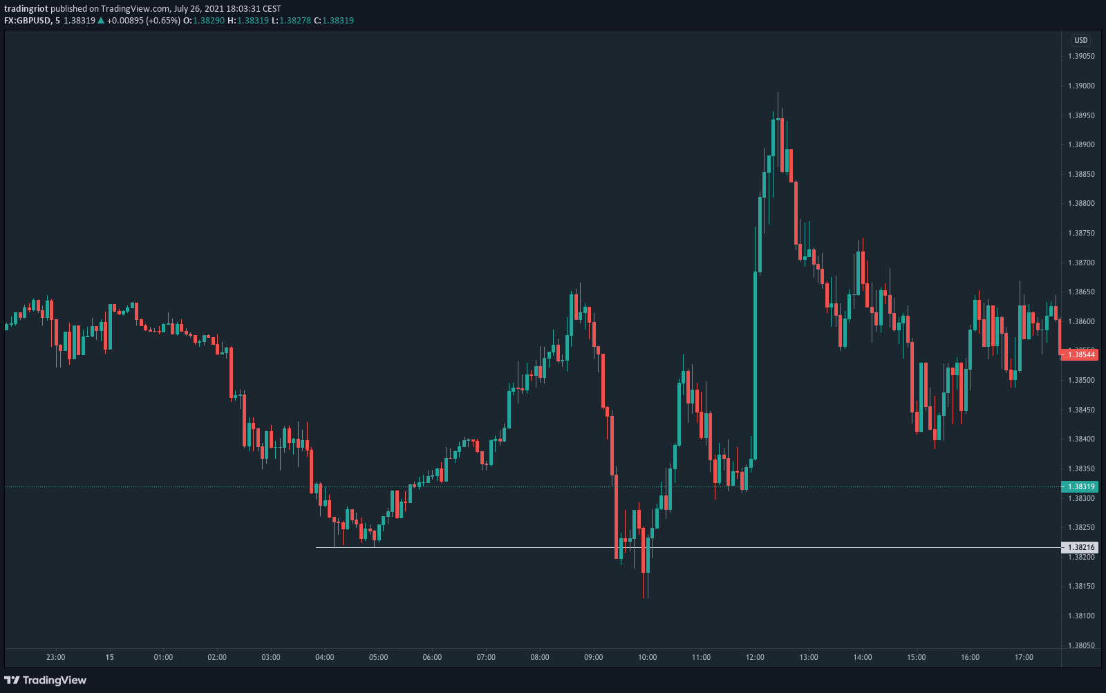
If we take a look at the example, you can see that GBP/USD probed the double bottom before the initial rally higher.
This is because under any key support and above resistance, there are two types of orders resting, there are stop orders from traders in longs that would get taken out from their trades, but also if the price would reach below this support level, it will draw the attention of traders who anticipate breakout and continuation lower.
This pickup in participation can be very often clearly seen on a Footprint chart.

I will spare you all the marketing talk about large players “trapping” retail traders and so on.
Although you can’t deny markets always find a way how to screw most people, trying to debunk the intention behind all the moves is pointless.
What is much more important is to realize when markets are in these liquidity areas so you can start paying attention and don’t end up on the wrong side of the move.
What is important to mention once again is the fractal nature of price, so the pattern you see on daily charts will also happen during the day.
Liquidity is a fairly complex topic; that’s why I covered it more in-depth in an article about Orderflow trading; in the Trading Blueprint, I also show the exact price patterns and how I enter the trades around these key levels.
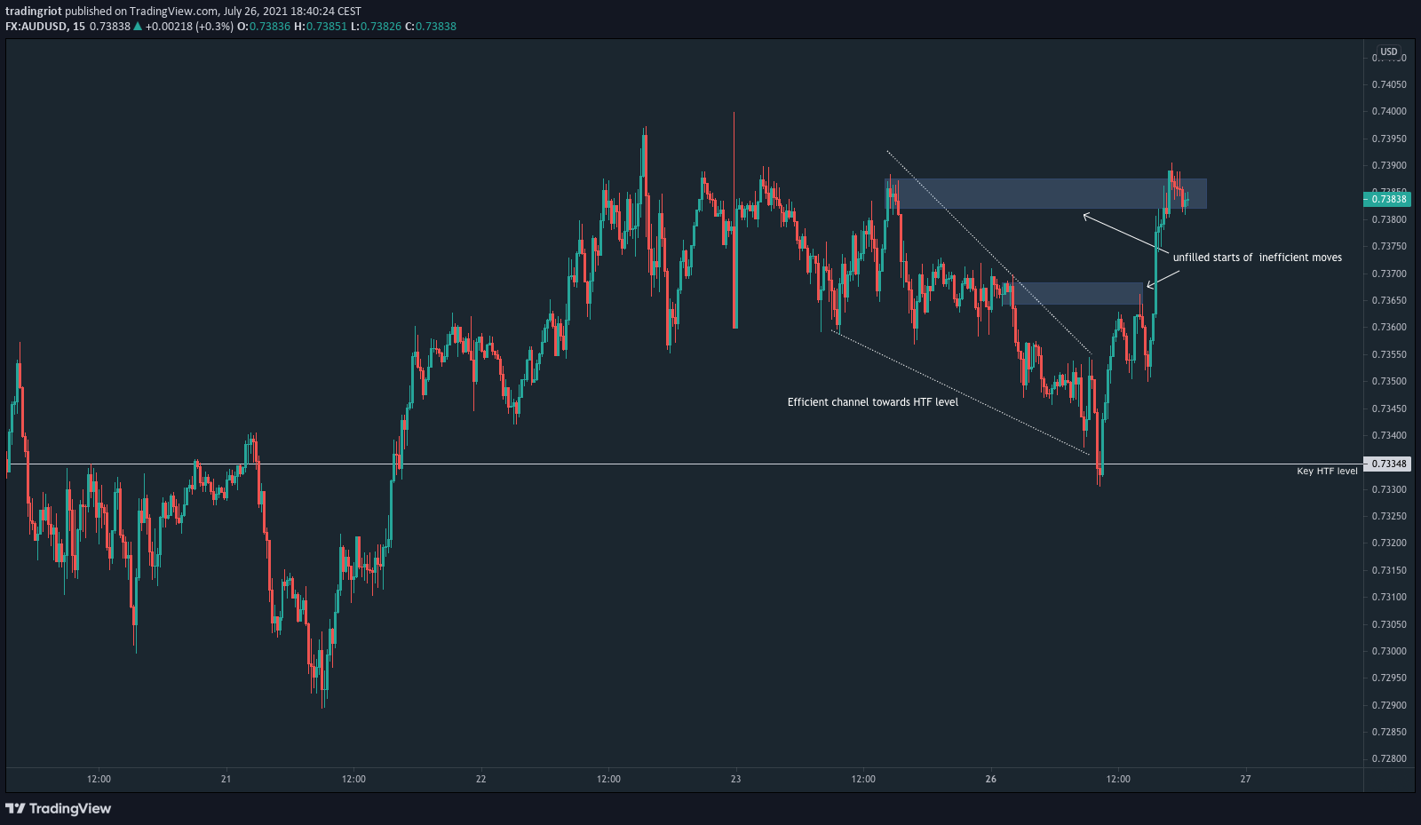
Efficient vs Inefficient Moves
You very often see people talk about “choppy” and “fast” moves in the market.
Although they are not wrong, this type of price action surely deserves a little bit more explanation.
From a liquidity perspective, there are 2 situations markets can be in.
The market can be either in the efficient state, this is the slow, choppy price action as there are many orders in the order books, and price just slowly grinds up/down, testing all the levels of resting liquidity.
The second state is an inefficient move where markets go into the state of low liquidity, quickly breaching levels with resting orders where they either fade or break through.

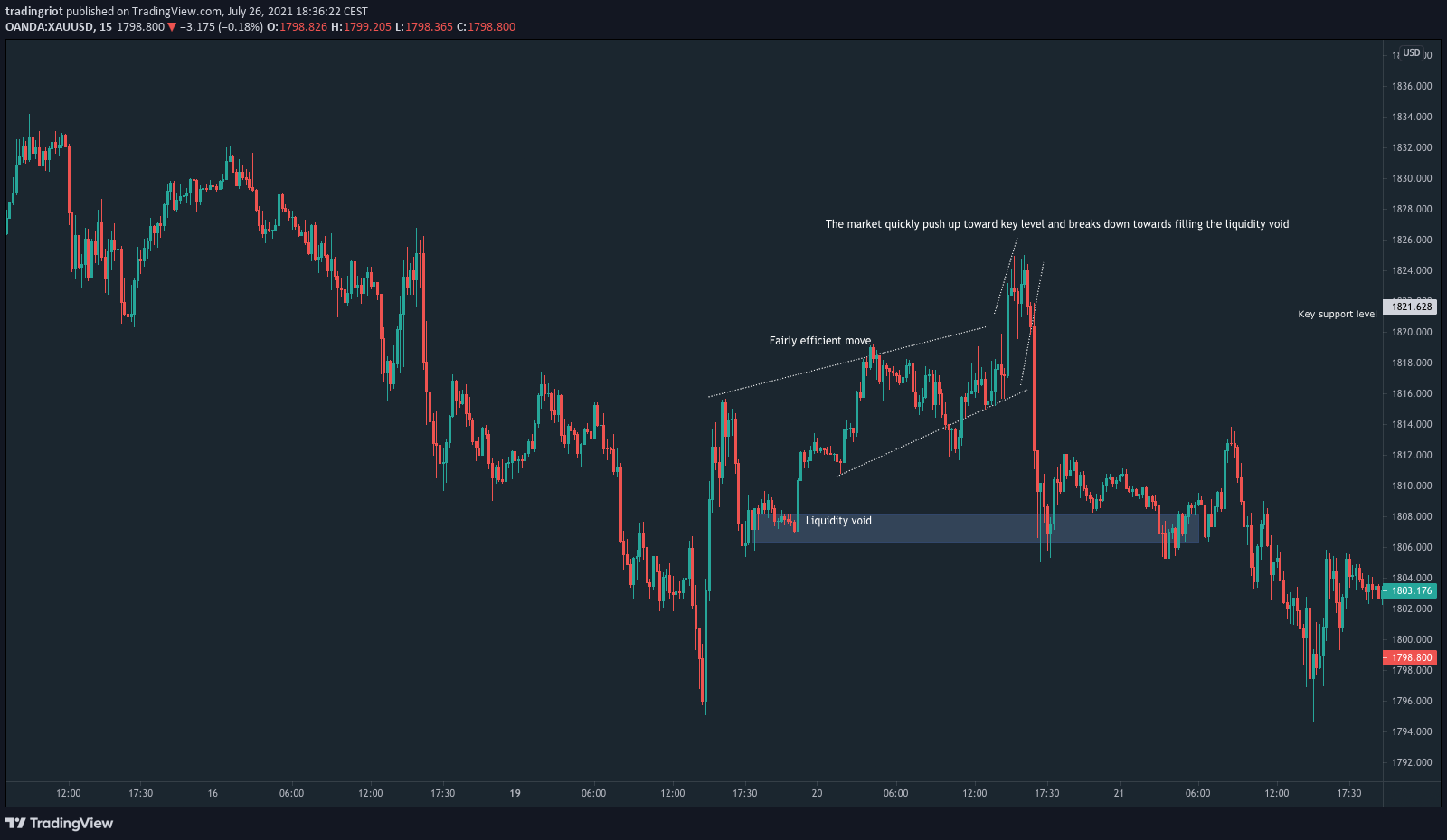
By looking at the example above, you can see the market slowly grinding toward key swing high (current high of the month), quickly pushing up and then collapsing even faster toward the swing low.
Why did this happen?
As the market was going up, it happened in a very efficient manner where all the levels of resting orders (liquidity) were immediately tested before another leg up.
Because of that, when the market went into an inefficient (low liquidity) state and passive sellers eventually absorbed aggressive buyers above the swing high, there were very few resting orders in the efficient channel, therefore very little support to hold the price on the way down.
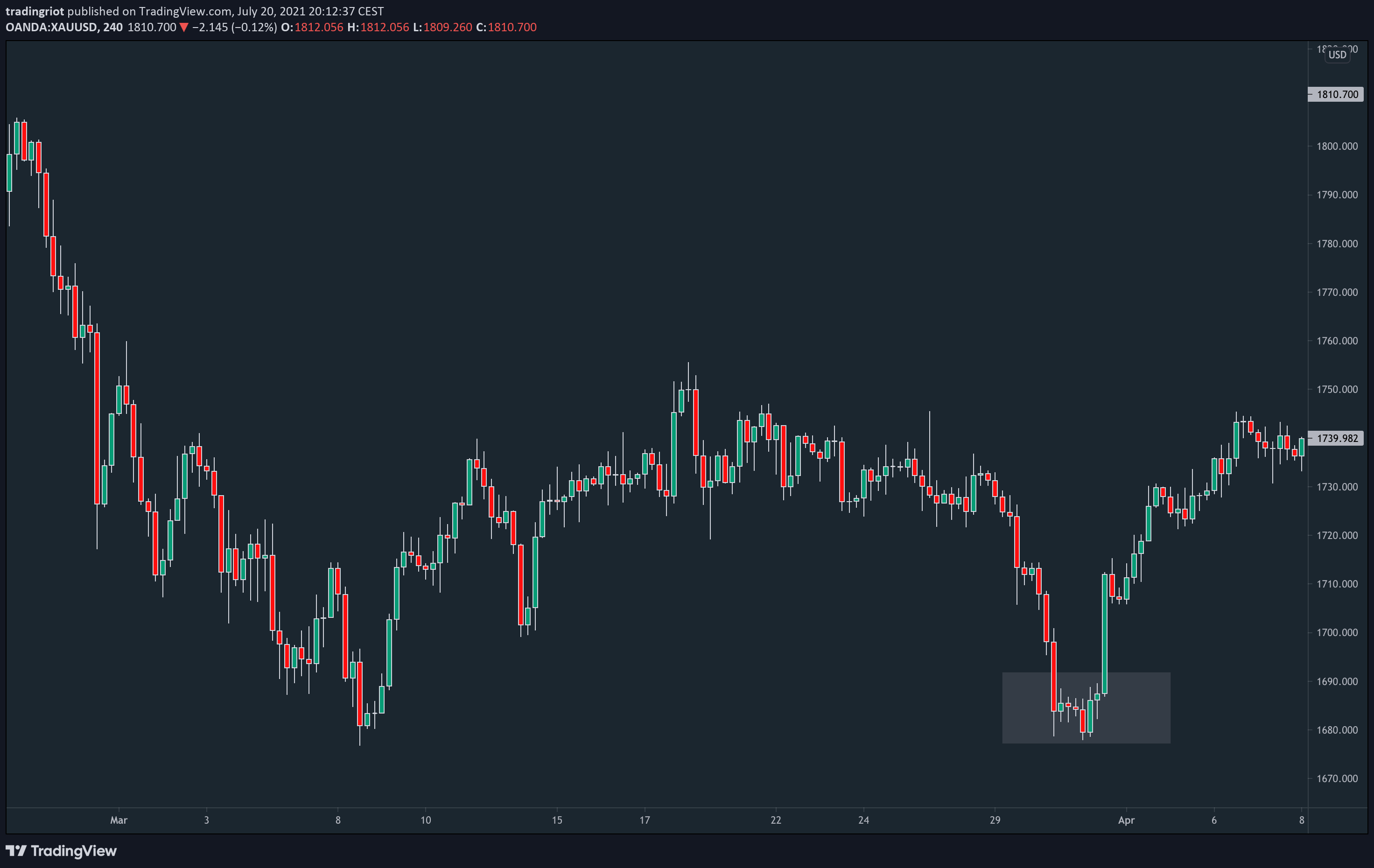
Very similar price action can be seen on this Gold chart where the market forms an efficient channel before the sharp move up and eventual collapse towards another inefficient level.
Conclusion
I hope I shed some light on the side of price action trading that is not so often discussed online.
Although I believe there are some limitations to price action, the concepts mentioned in this article should be more than enough to build a solid price action trading strategy.