
Sierra Chart Full Tutorial – How to set up Footprint, Market Profile, DOM and other orderflow tools!
Sierra Chart is really a unique trading platform.
Not only because of what it can offer for your trading.
But mostly because of their approach to the whole trading industry.
As we live in a time and age where social media and user experience is pretty much everything.
The team at Sierra chart decided to use a quite and different approach with strongly opinionated topics at their support forum (like this Covid-19 conspiracy theory), no social media presence whatsoever, and the UI which can take right back into the 90s when you first installed Windows 95.
All of this can make a very difficult start if you are completely new to the Sierra Chart as you can have quite a hard time navigating around and set up all the charts you need.
This was exactly my first experience with the platform so I hope that this article will make your first use much easier.
The truth is that once you learn to use Sierra Chart, you will end up with a really great platform that is very cheap, highly customizable, and offers a very easy and user-friendly way of trading.
If you are anything like me and you are not a fan of these “too user-friendly” platforms which you can find mostly on crypto exchanges as they try to gamify the whole trading experience with flashy colors without any advanced orders types and chart settings so retail traders don’t even have a space to learn something new, you will find Sierra Chart being an amazing addition to your trading.
In this article, I will cover the basics of how you can get and set up the Sierra Chart, but instead of talking about different indicators, drawing tools, etc.
I will focus on trading tools that I use in my own trading such as Footprint Charts, DOM, Market, and Volume profile.
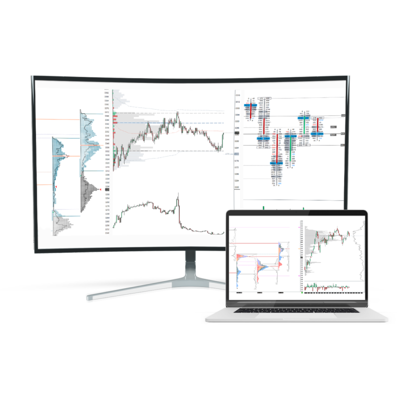
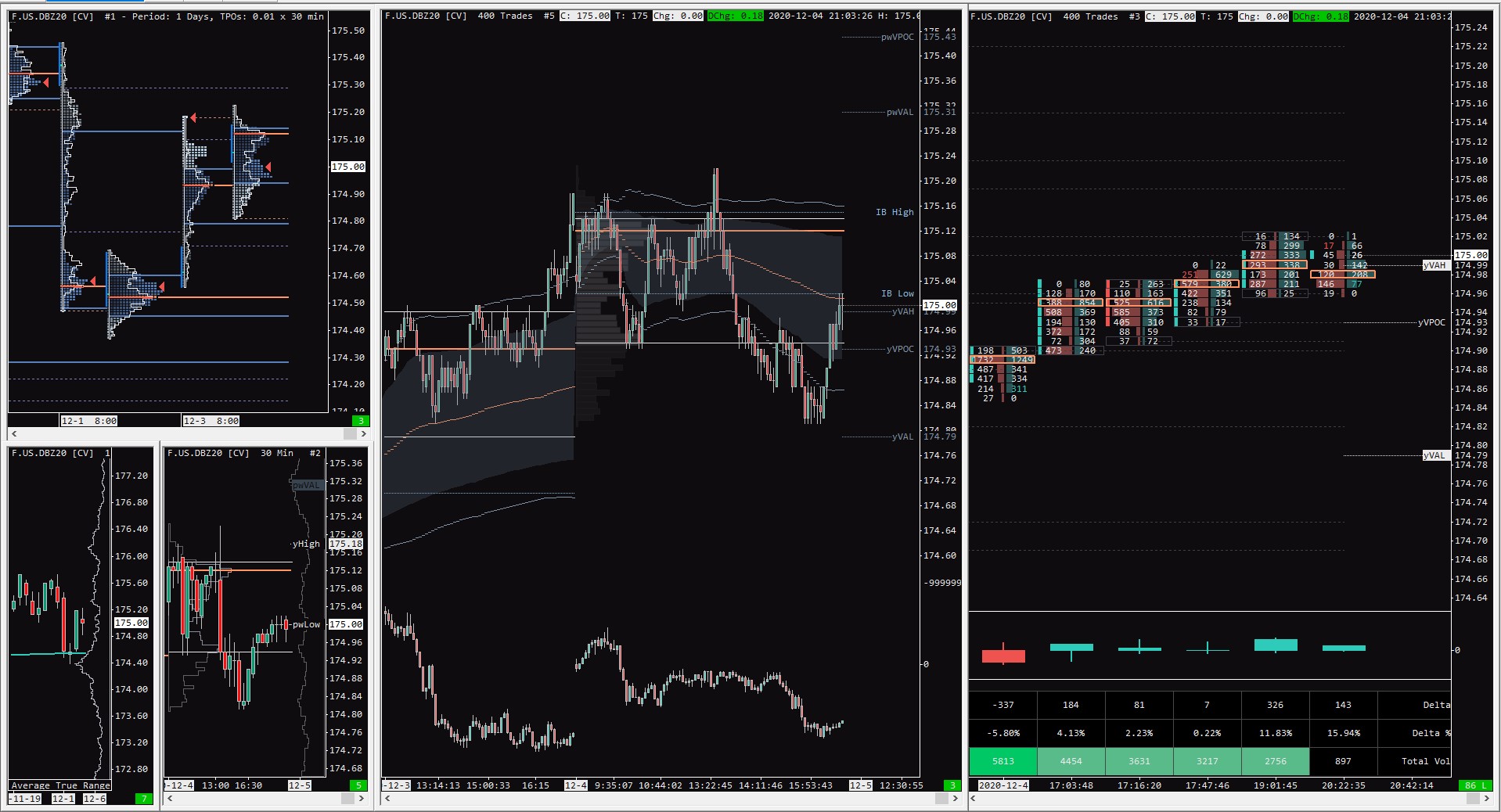
Once you finish this article you will be able to set up your own Chartbook the way it will look like this.
If you like this article, read the rest of the blog or join the Tradingriot Bootcamp for a comprehensive video course, access to private discord and regular updates.
For those who are looking for a new place for trading crypto, make sure to check out Woo. If you register using this link and open your first trade, you will get a Tier 1 fee upgrade for the first 30 days, and we will split commissions 50/50, which means you will get 20% of all your commissions back for a lifetime. On top of that, you will receive a 20% discount for Tradingriot Bootcamp and 100% free access to Tradingriot Blueprint.
You can also watch and follow along the tutorial on Youtube:
Table of Contents
Is Sierra Chart free?
The answer to this would be yes and no at the same time.
If you go to the official Sierra Chart website, you will see two options for Package 3 and Package 5.
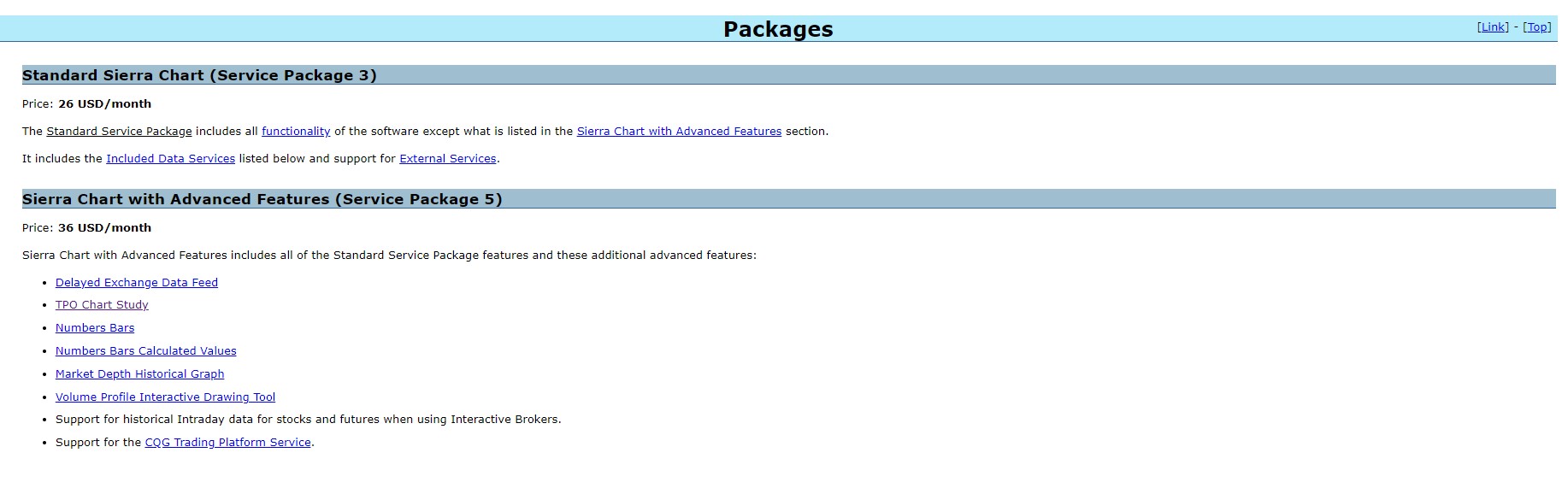
Package 3 will cost you $26 a month and Package 5 is for $36/month and they also offer discounts if you buy it for multiple months.
If you are interested in trading Orderflow and using Market Profiles in your trading, you will need to buy Package 5 for $36 a month.
This also contains live market data for any cryptocurrency trading (Bitmex, Coinflex, and Deribit as December 2020).
What it does not contain are data for legacy markets, these will usually cost anything between $10-$100 per month depending on different exchanges.
But as I have already mentioned, Sierra Chart can be free.
If you open an account with AMP Futures, you will get access to Sierra Chart Package 3 for free.
Although this means that you won’t have access to any Orderflow and Market Profile tools and you also won’t have access to cryptocurrency data as they are not provided in this special AMP edition, you still can subscribe for live data and trade by using price action or classic indicators.
What I think will be the best thing to summarize pricing is Sierra Chart is to tell you how much I pay for a month.
Because I trade both crypto and legacy markets, I buy my Sierra Chart Package 5 for $36 a month directly through their website.
I use AMP Futures as my broker and they actually offer a discount of $25 for a month for Package 5, but as I want to access cryptocurrency data I don’t use this deal, if you want to only trade legacy futures and don’t care about cryptocurrency, you can get Package 5 on AMP for $25 a month.
For data, I use a CQG and although there are a lot of complaints online about the CQG data feed, I never had a single problem with it.
What is also worth mentioning is that the CQG data feed only gives you ten depths of the market so if you are looking for more it is not the best choice.
Here is a CQG data feed pricing list.
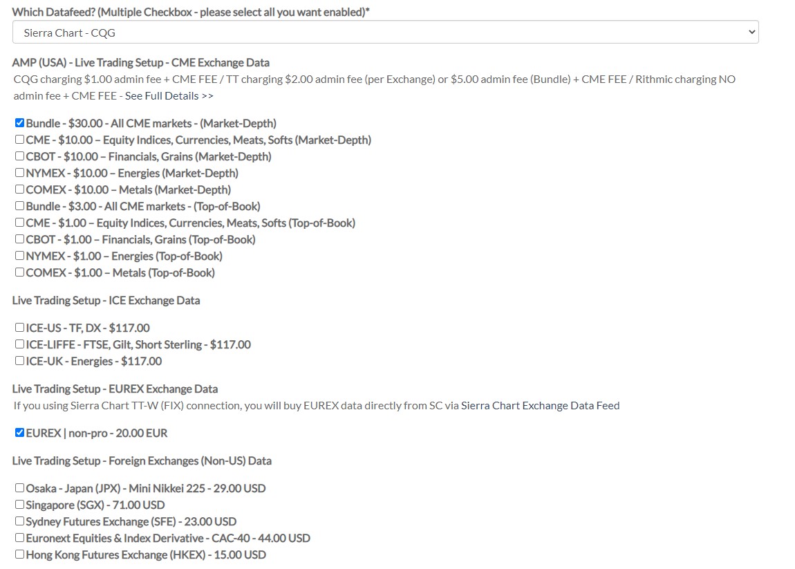
The checked data feeds are what I am subscribed for so in total I pay around $80 a month.
Of course, you can get it cheaper or more expensive mostly depending on the markets you want to trade or you can also choose only Top-of-book data for CME which will show only 1 level of depth, it is up to you.
Setting up Sierra Chart
So let’s assume that you figured out your preference for Data and you have downloaded Sierra Chart from the website.
If you didn’t, you can still use a Free 14 day Trial.
All you have to do is register on the website and you will find a Free Trial option there.
Once you install the platform you will log in and use either the same credentials you used when you registered on the Sierra Chart website or you will get login credentials from AMP Futures if you used their website.
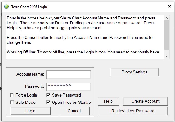
Once you log in to the platform you will go to File -> Data/Trade Service Settings.
This is where you enter your login credentials for the data feed you plan to use.
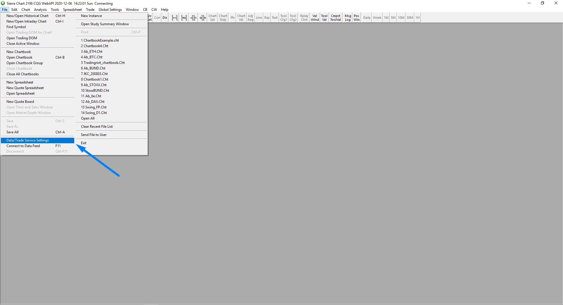
If you use a legacy exchange, you will most likely receive the credentials in your email address, if you plan on trading crypto on Bitmex, you need to have an account on the exchange and then proceed with setting up the API key.
The full Sierra Chart connection guide for Bitmex can be found here.
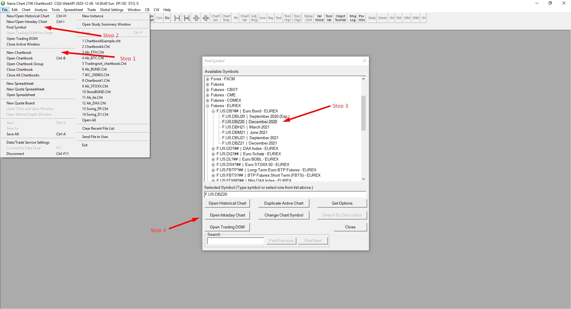
Once you are connected you want to go to File -> New Chartbook.
Chartbook is eventually a place where you can have a different chart for the same (or different) instrument.
I have a chartbook for every instrument I trade.
Once you have your chartbook created, go to File -> Find Symbol, there you can choose any symbol you want and open a chart for it.
In this article, we will focus on the German Bund, which is the market I personally trade but you choose anything you have an active data subscription for.
After you choose your product, you want to click on Open Intraday Chart.
Here is where our charts will most likely differ based on color and font.
If you want to change the aesthetics of your chart, you have to go to Global Settings -> Graphics Settings – Global.
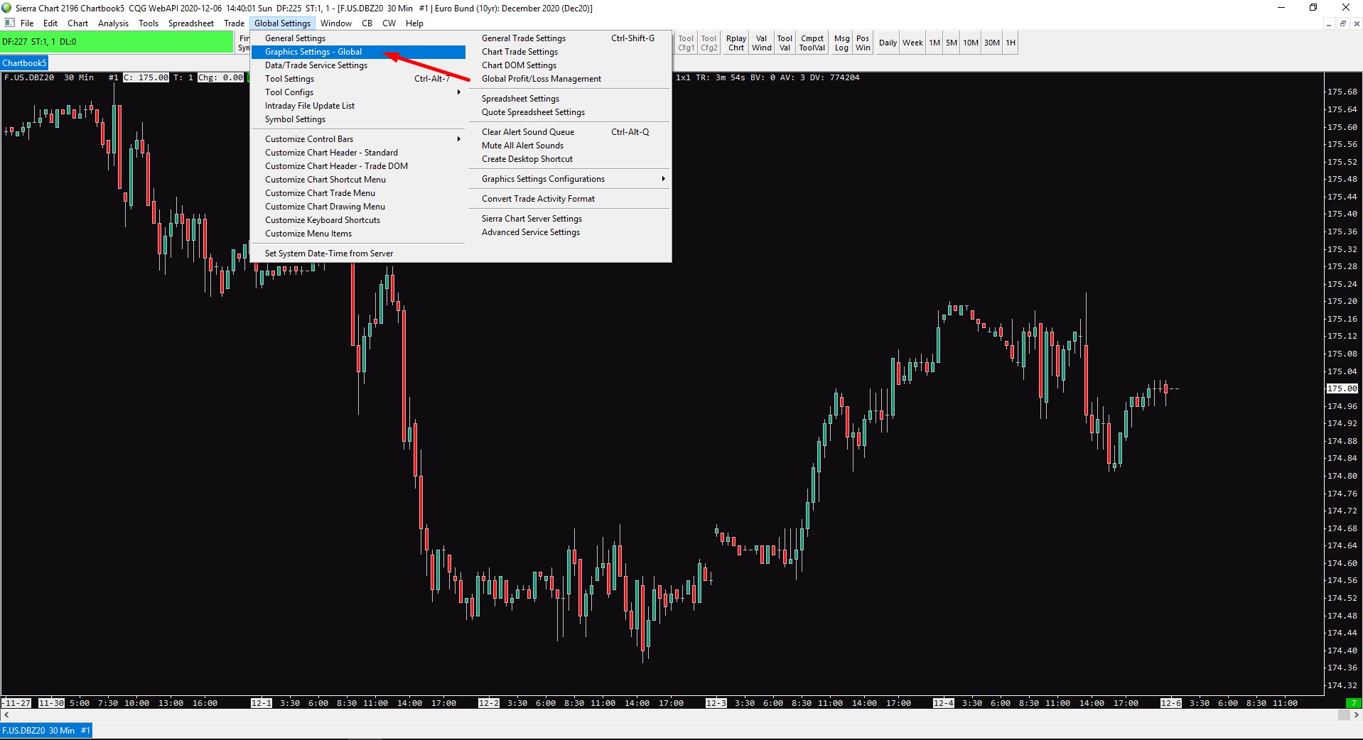
I am not going to go through every option you have there, you should take some time to play with different color settings and find what suits you.
Once you are done, you have to make sure that you have checked “Use Global Graphics Settings Instead of These Settings” in Chart -> Graphics Settings – Chart.
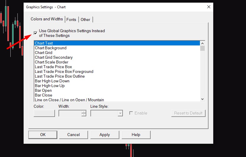
If you don’t have this checked, this chart won’t use the Global Settings but the individual chart settings, this is good when you want to have a different color scheme for different charts.
The Sierra Chart is an extremely customizable software and I think that even if I would spend hours with this article I wouldn’t be able to cover everything you can customize.
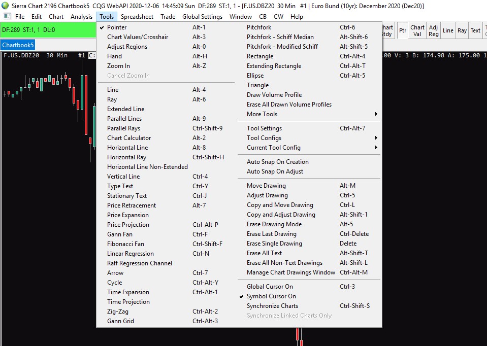
What is worth to mention are Tools where you can find all your classic drawing and charting tools.
Now as we covered the basics let’s have a look at how you can add different Studies to your chart.
Before you start to add all these Studies you should go to Chart -> Chart Settings and make sure you have a few things set up properly.
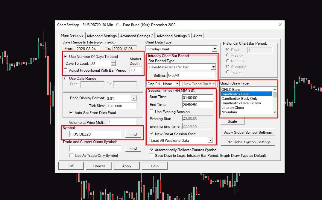
This is the first Main Settings window with highlighted boxes pointing out some more important things.
They are quite straightforward, make sure that you set up proper trading hours for each instrument you are trading, if you don’t know these trading hours, you can find them in an article about Futures trading.
Bar period type gives you the option for changing different timeframes both time and non-time based.
Another way of doing this is directly in your chat window all you have to do is press the number and shortcut for the timeframe and then pres enter.
So for example, if you want to go to the 60-minute timeframe you have to type 60m and press enter.
If you want to view the 500 tick chart, you have to press 500t and enter.
Graph Draw Type changes the visual representation of your chart from candlesticks to OHLC bars and much more, this is something that is totally up to you.
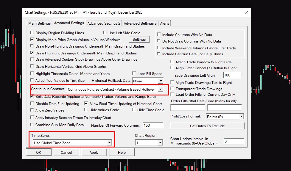
If you change a tab and go to Advanced settings, make sure you have set up proper Timezone, and also you can set up Continuous Futures Contract – Volume Based Rollover so you won’t have to manually change contracts when they expire and you will also be able to see past data instead of just those for the current contract.
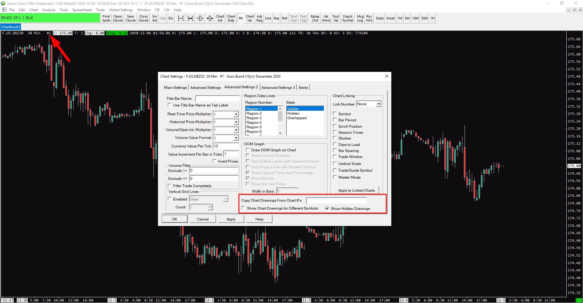
In the Advanced Settings 2 window, you have a tab called Copy Chart Drawings From Chart #:
As you can see on the screenshot below, every chart inside the chartbook has its own number.
If you have for example two charts open with #1 and #2, you can type 2 inside that box and it will automatically copy all drawings like lines, boxes etc. to chart #1.
More advanced tip, if you work with multiple Chartbooks and you want to copy drawings across them, the code is [chartbook name]:[chart number]. (Example: Chartbook1:4, Chartbook1:2)
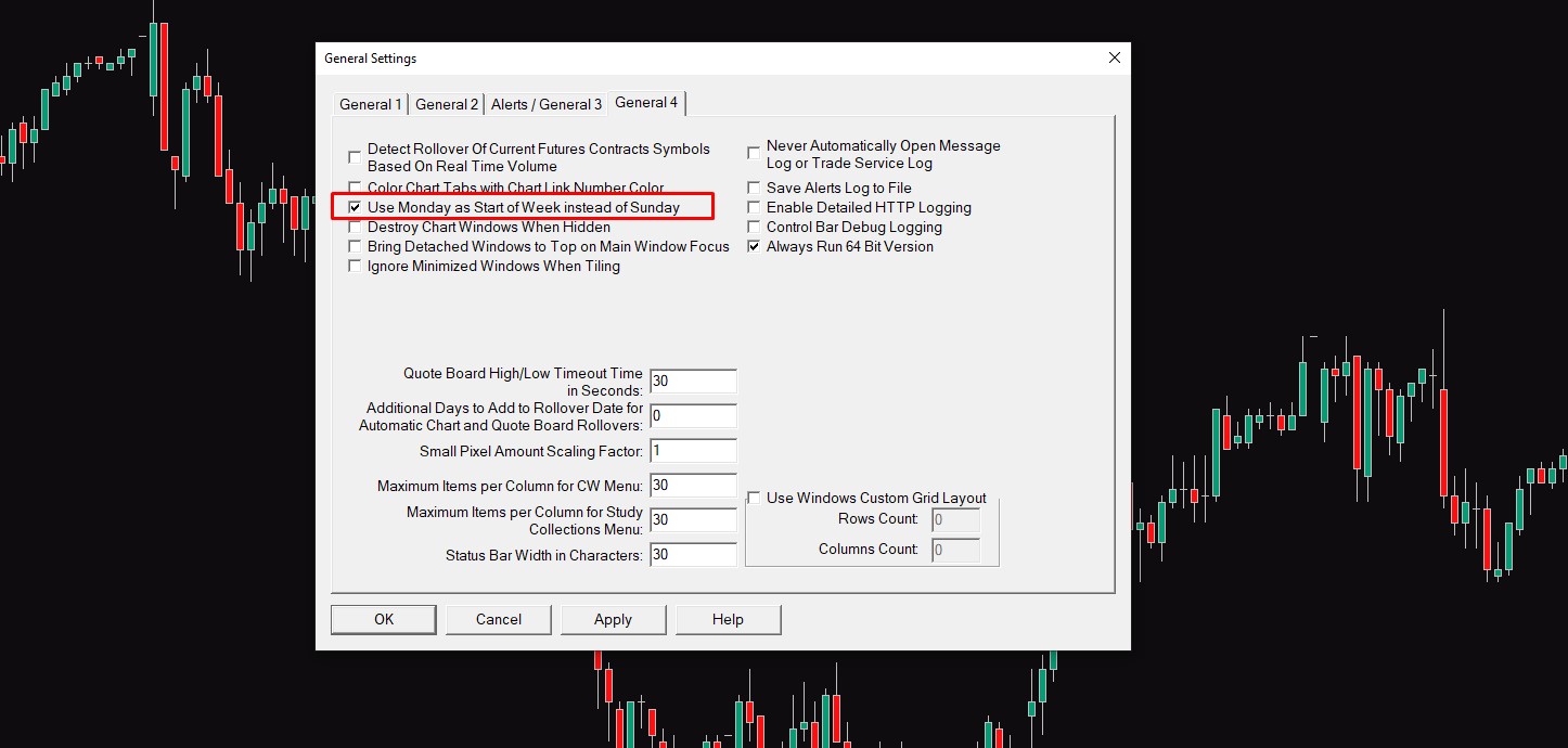
One more important setting for those who are trading Cryptocurrencies can be found in Global Settings -> General Settings -> General 4.
There you have to check the box saying Use Monday as Start of Week instead of Sunday.
If you don’t do that your weekly chart will start on Sunday and you will run a lot of different problems.
This is it for general settings in Sierra Chart, I am sure I haven’t covered everything but if you have any questions feel free to comment below this post or just google it and you will find an easy fix in the Sierra Chart support board.
How to add Volume Profile, VWAP, Initial Balance, and Cumulative Volume Delta in Sierra Chart
So now that you have your chart set up, it is time to add some studies.
If you press F6, a new window with different indicators pops up.
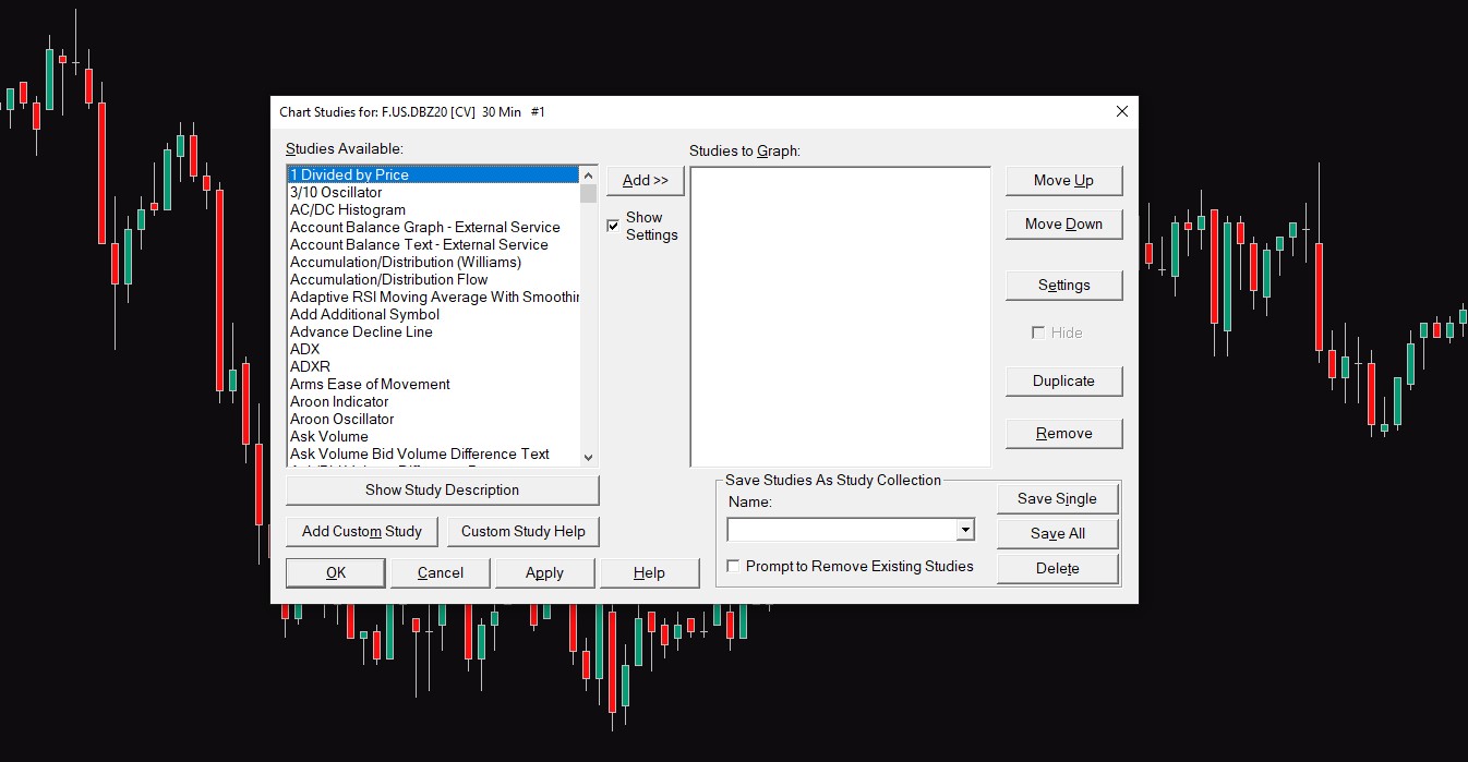
There is a ton of them and there are also indicators made by the community which you can find in Add Custom Study so it is well beyond this article to go through all of them.
What we are going to do is add those that I use for my trading.
These indicators are namely:
- Cumulative Delta Bars – Volume
- Initial Balance
- Volume By Price
- Volume Value area Lines
- Volume Weighted Average Price
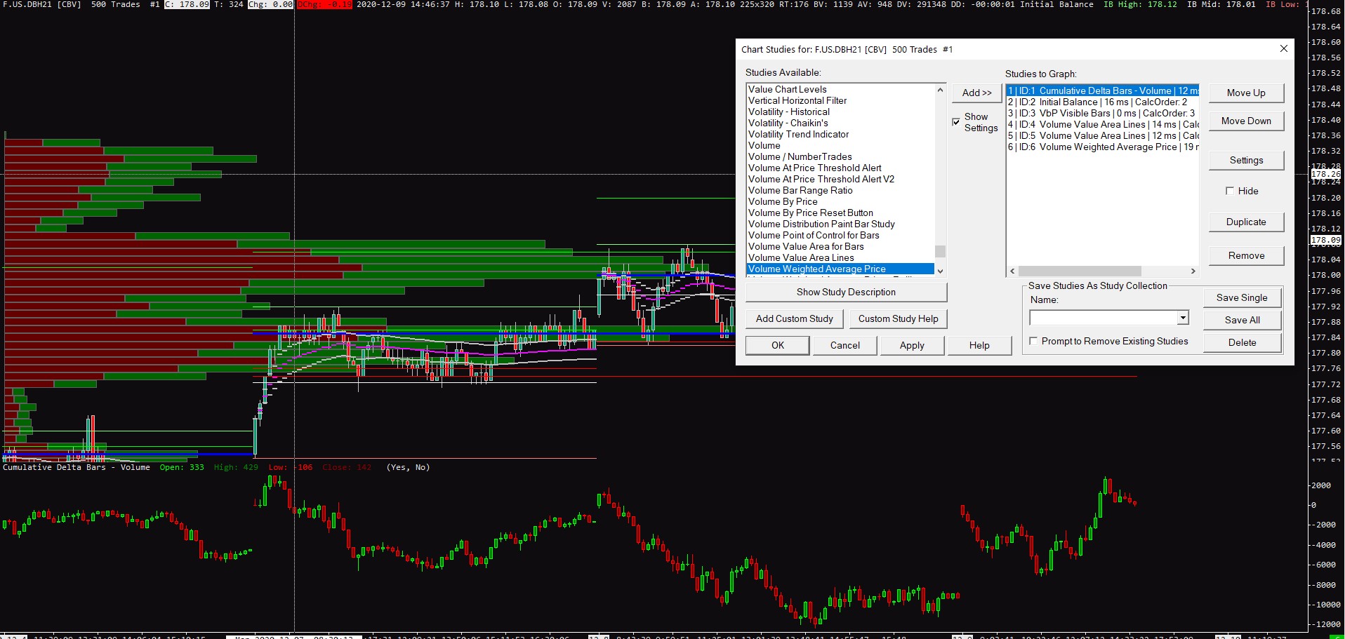
As you can probably notice your chart looks like a mess so we have to set tune these up a little bit.
I won’t cover how exactly I use these in my trading, it is covered in detail in the Trading Blueprint.
How to set up Cumulative Volume Delta in Sierra Chart
Cumulative delta bars – Volume is the first indicator we have added to our chart.
It is an indicator that plots finalized executions on Bid and Offer. (More info)
It setting is very easy as you only have to options to change.
Reset at Start of Trading Day and Reset at Both Session Start Times.
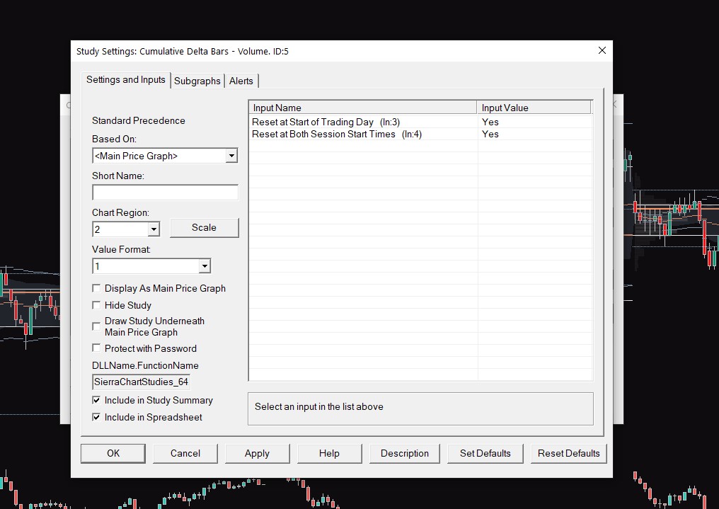
These settings are tied to the trading hours of your chosen instrument, if you don’t know what trading hours you should set up, you can find specific instrument settings in this article.
In the Subgraph section, you can change the colors of the indicator, which is up to your preference.
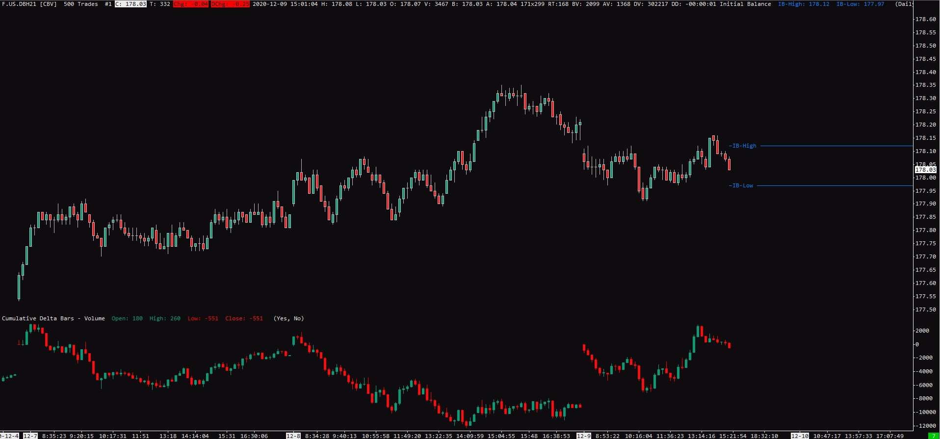
How to set up Initial Balance in Sierra Chart
The initial balance is a range that represents the first two TPOs for the given session (More Info).
If you double-click on the indicator, you can see the window where you can set up the Initial Balance time.
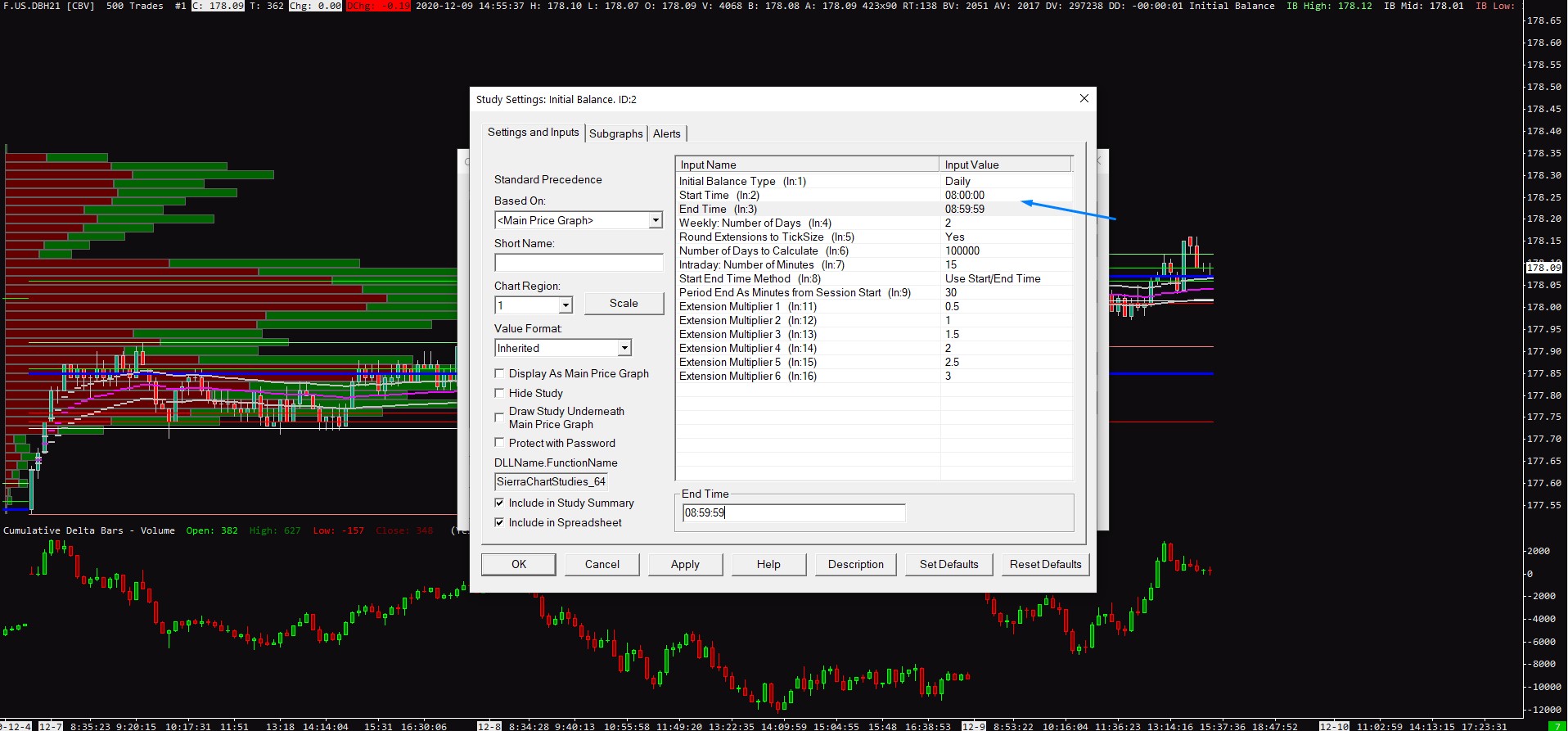
In the subgraph section, you can change the visual settings for Initial Balance.
This is my personal preference but I don’t like to have ten different lines going over my chart, because of that I change the Dash draw style to Line at Last Bar to Edge.
You can also add Name and Price Labels and into section Short Name type the custom name for the IB highs and lows.
Once again, personal preference, but I don’t use any IB extensions or middle line.
Now your Initial Balance should look something like this.
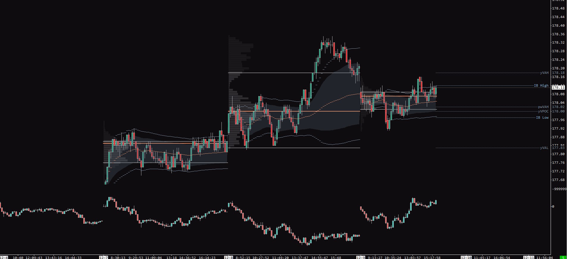
How to set up Volume Profile in Sierra Chart
Compared to the traditional volume which is displayed on the x-axis, the Volume profile displays the volume on the y-axis (More Info).
By default, you have a volume profile that measures all Visible Bars in the chart.
Although this is not a bad setting if you want to monitor different ranges or higher-timeframe structures, we want to set up a Volume profile for each trading session.
Doing this is very easy, first in Draw Mode set up Volume Profiles and POC, VAH, VAL, VWAP, and in Volume Graph Period Time set up Multiple profiles based on a fixed time.
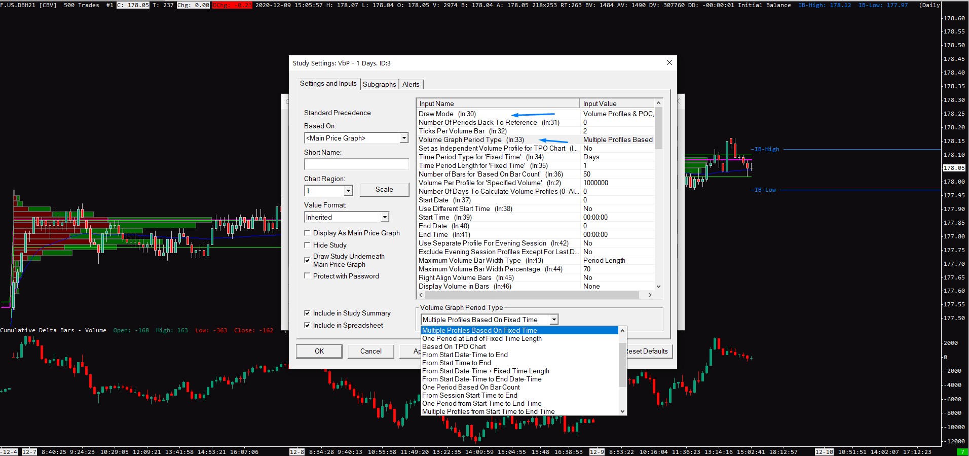
Once you do this you are pretty much done, there is a lot of different settings that I won’t cover in this article and the best thing you should do is play with all of them.
But one set is important to mention, Ticks Per Volume Bar.
For liquid markets like Bund you want to set it to 1, but if you open the chart of Bitcoin and you will have Tick Per Volume set up at 1, your chart will look like this.
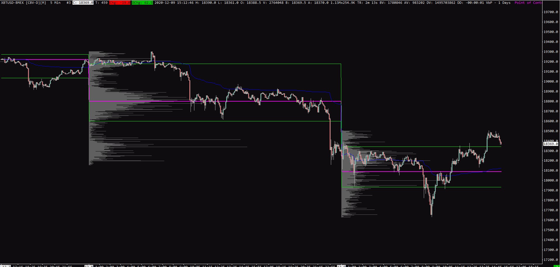
As you can see volume profile now shows a line for each tick in the chart which can be a lot for thin markets like Bitcoin or Dax.
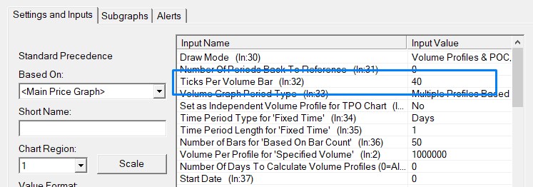
This is why we want to change the value for something higher to have a more clean looking Volume profile, the number constantly changes with volatility but with BTC you want to be somewhere between 20 and 40.
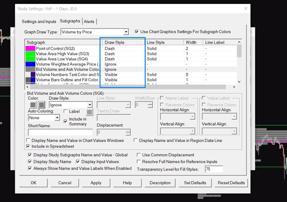
In the Subgraphs section you want to change Draw Style for all lines from Line to Dash, this way lines will end up at end of each day/session and won’t connect to each other.
You can also ignore Volume Weighted Average Price as we will add it as a separate indicator.
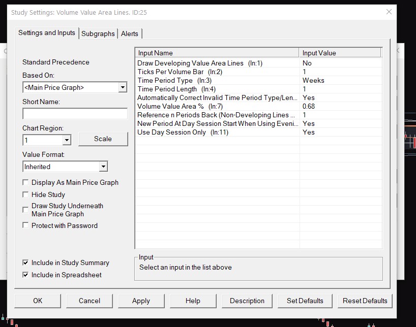
The next indicator which is tied to the Volume profile is Volume Value Area lines, these show you previous daily or weekly profile lines right in your chart, setting those up is very easy, you just change the Time Period Type to Days or Week and Time period Length to 1.
In the Subgraphs, settings make sure to set Draw Style to Line at Last Bar to Edge so lines won’t cover your candlesticks.
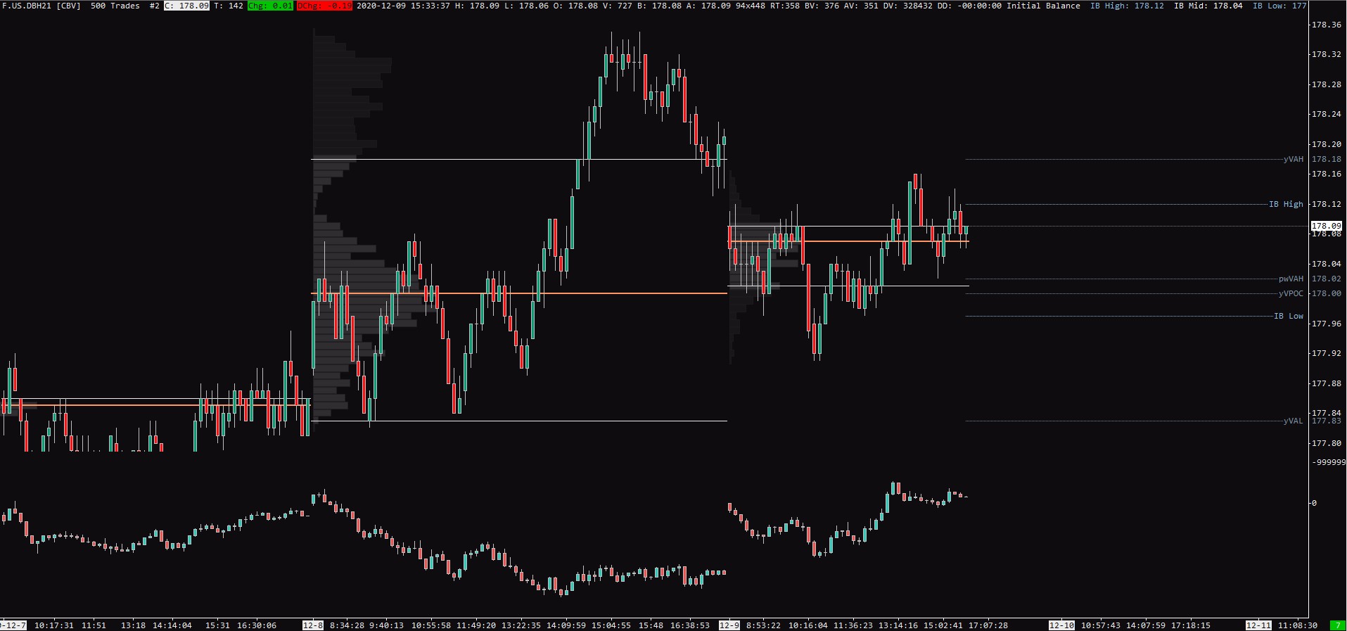
Here is how the chart looks so far.
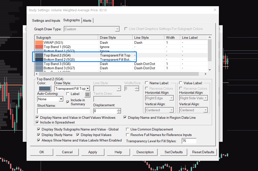
How to set up Volume Weighted Average Price (VWAP) in Sierra Chart
Compared to the simple moving average, VWAP adds volume to its calculation (More Info).
Setting up VWAP in Sierra Chart is very easy as you don’t change any settings.
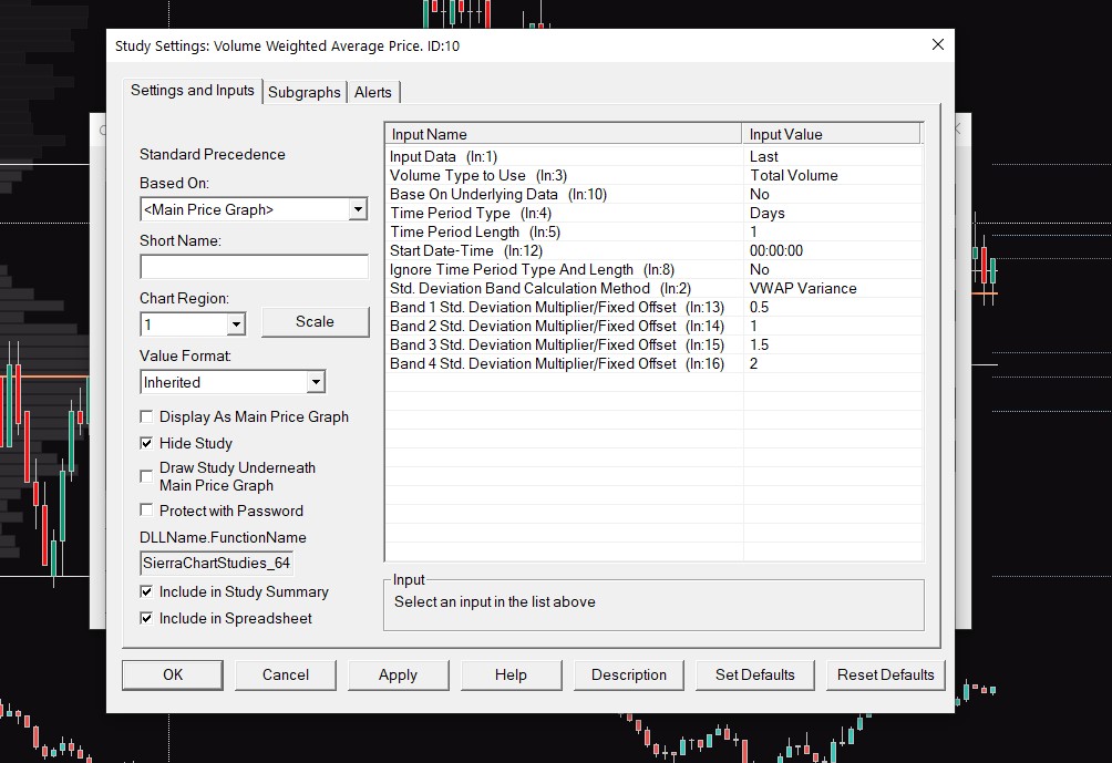
All the important stuff is done in the Subgraphs setting where I personally ignore all the Standard deviations instead of Top and Bottom Bands 2.
Because I want to have these standard deviations set up as bands, I use Transparent Fill Top and Transparent Fill Bottom.
And that’s it, your price action chart is now done with all indicators that I use in my trading.
How to set up Market Profile in Sierra Chart
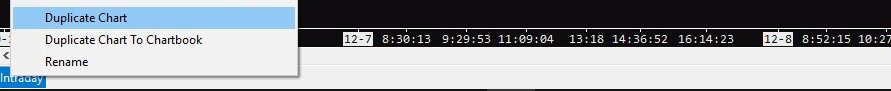
On the bottom left corner of your screen, you have your already made chart, if you right-click on it you can duplicate it so you won’t have to set up trading hours and instruments again.
Once your chart is duplicated you want to set it on a 30-minute chart and after pressing F6 deleting all the indicators.
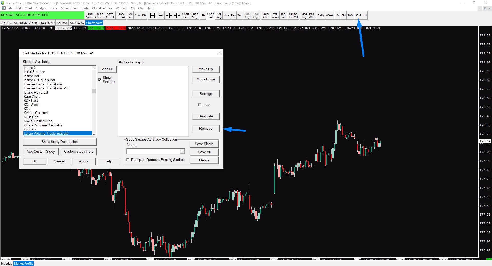
The indicator you are looking to add is called TPO Profile Chart, once you add it, your chart will turn into a TPO profile chart.
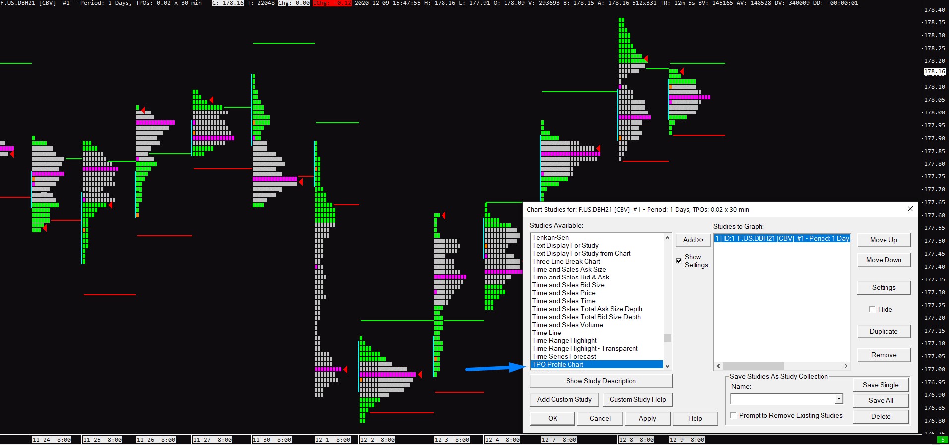
There is a lot you can configure in the setting of the TPO Profile Chart, and I really recommend you to read this article so you have great knowledge about Market Profile itself, it will make things much easier.
Here are some of the most important settings but once you again, you really should go through each one of them and play with them by yourself.
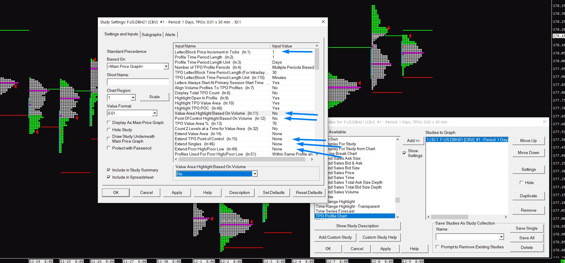
Letter/Block Price Increment in Ticks is the same as we had in Volume Profile, low Tick values are suitable for slow liquid markets, if you are trading thin markets you should increase the settings.
Value Area Highlight Based on Volume/Point Of Control Highlight Based On Volume this is up to your personal preference but this setting will change your TPO chart to show Value and Point of Control based on Volume, not Time.
This is something I use in my trading.
Extend Value Area/Point of Control/Singles/Poor High and Low I use Until Future Intersection setting, this way I can see all the TPO characteristics coming in play without scrolling through different days and looking for them manually.
There is a lot of visual settings in Subgraphs and these are once again up to your personal style.
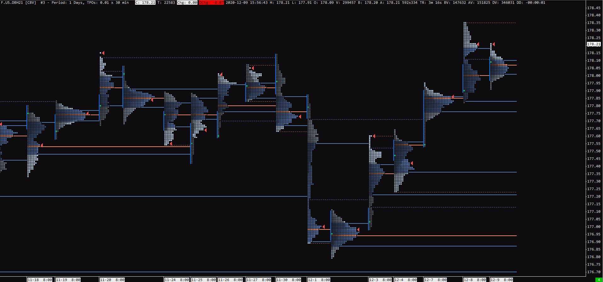
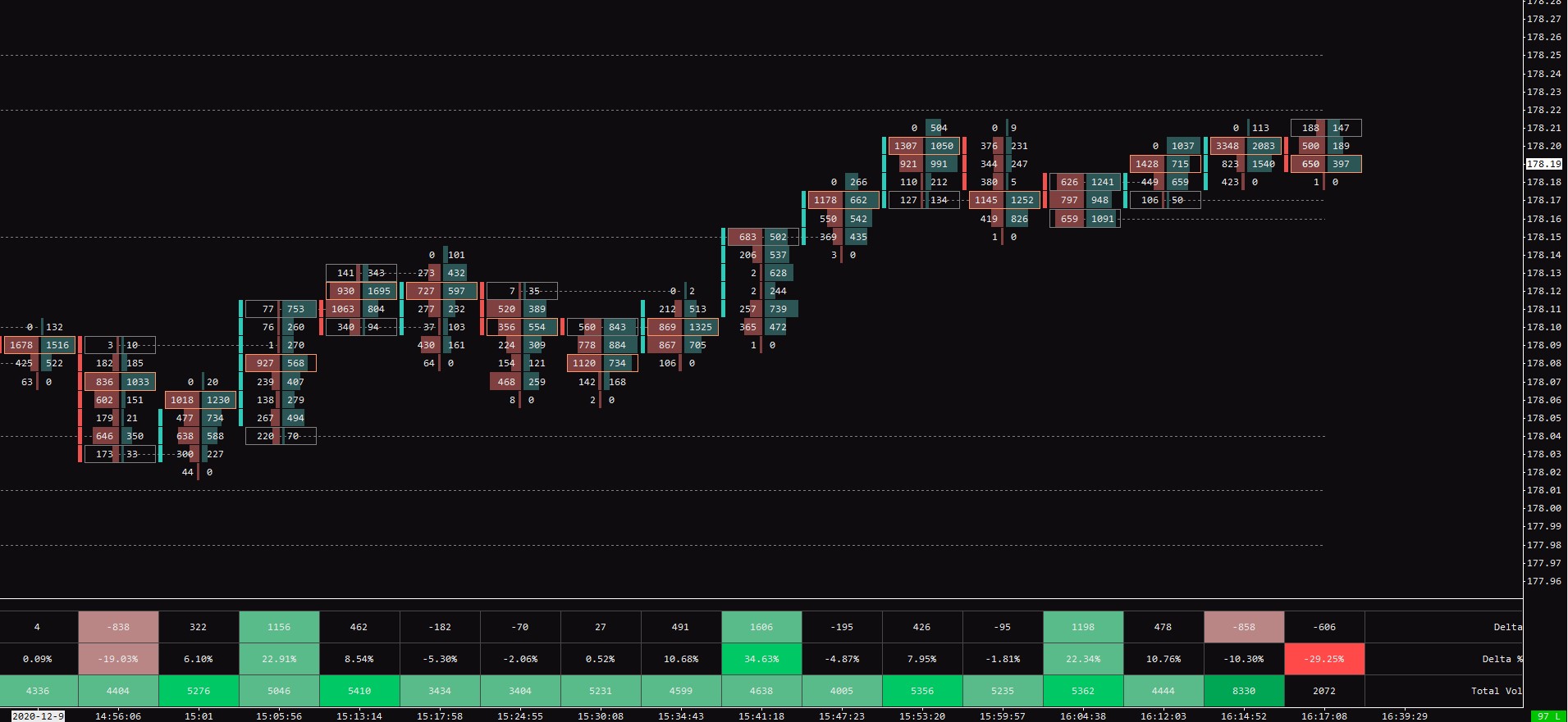
Once you are done, your TPO chart can look something like this.
How to set up Footprint Chart in Sierra Chart
Because the name Footprint Chart is copyrighted by Market Delta, you won’t find this exact name in Sierra Chart or any other trading platform.
In Sierra Chart you once again want to press F6 and look for an indicator called Numbers Bars.
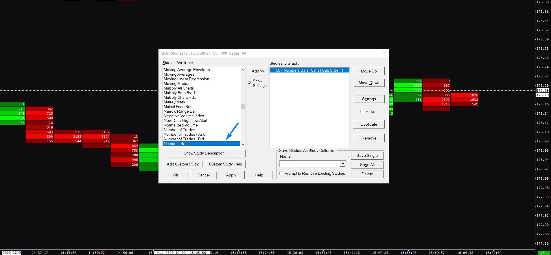
There is a lot of different types of Footprint Charts you can set up.
Once again, having a great understanding of things is well recommended and you can learn more in this article.
Here is the setting I have decided to demonstrate as one of the most common ones, the Bid-Ask Footprint with colored background based on the Diagonal Dominant Side.
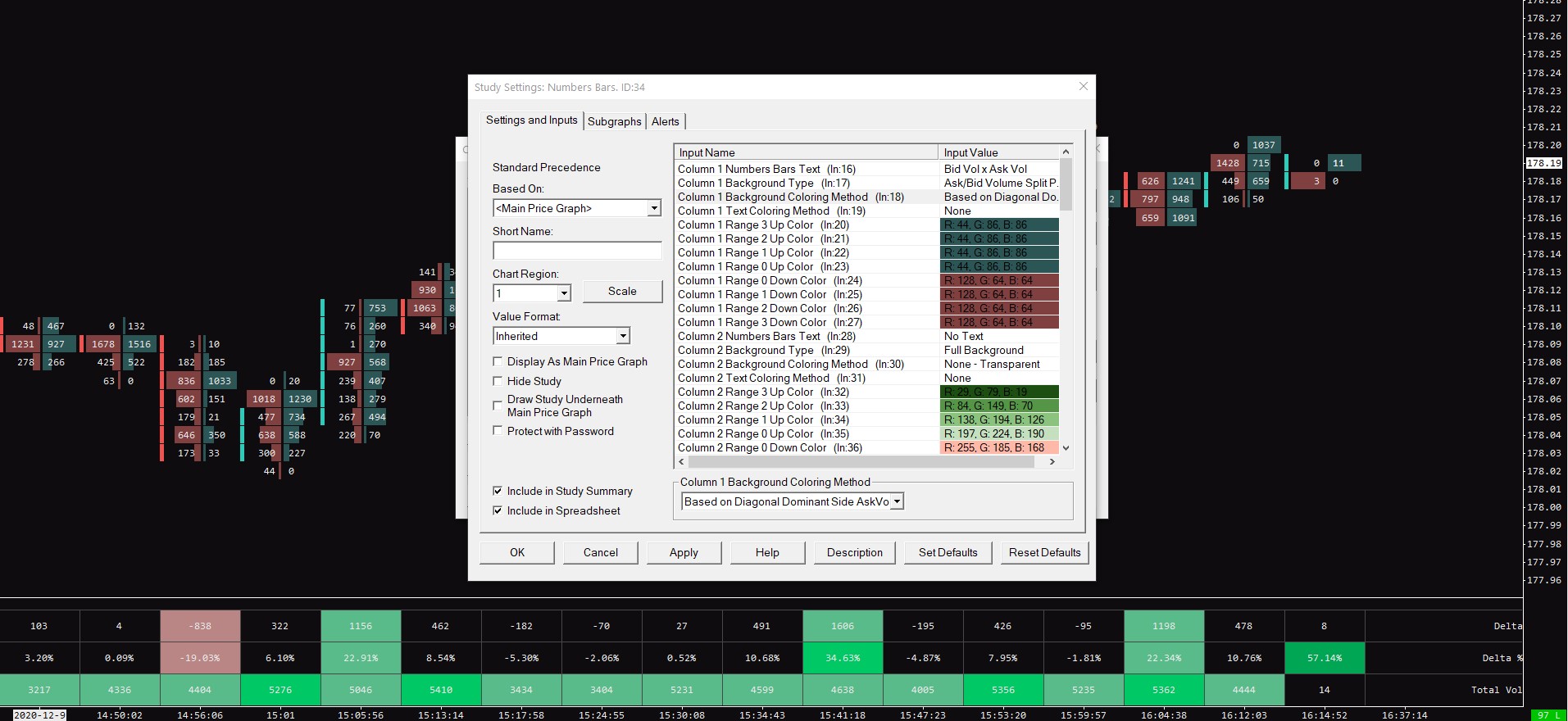
All the settings that change the footprint chart are in Column 1 and you should play by them to see what they do.
This simple Bid-Ask Footprint has the following settings.
Column 1 Numbers Bars Text – Bid Vol x Ask Vol
Column 1 Background Type – Ask/Bid Volume Split Profile
Column 1 Background Coloring Method – Based on Diagonal Dominant Side AskVol BidVol Percentage
You can also Highlight the Point Of Control which is under setting 71.
If you scroll all the way down, you will find a setting called Highlight Nonzero Bid-Ask Volume at High/Low, by turning this on, your footprint char will automatically highlight Unfinished Auctions.
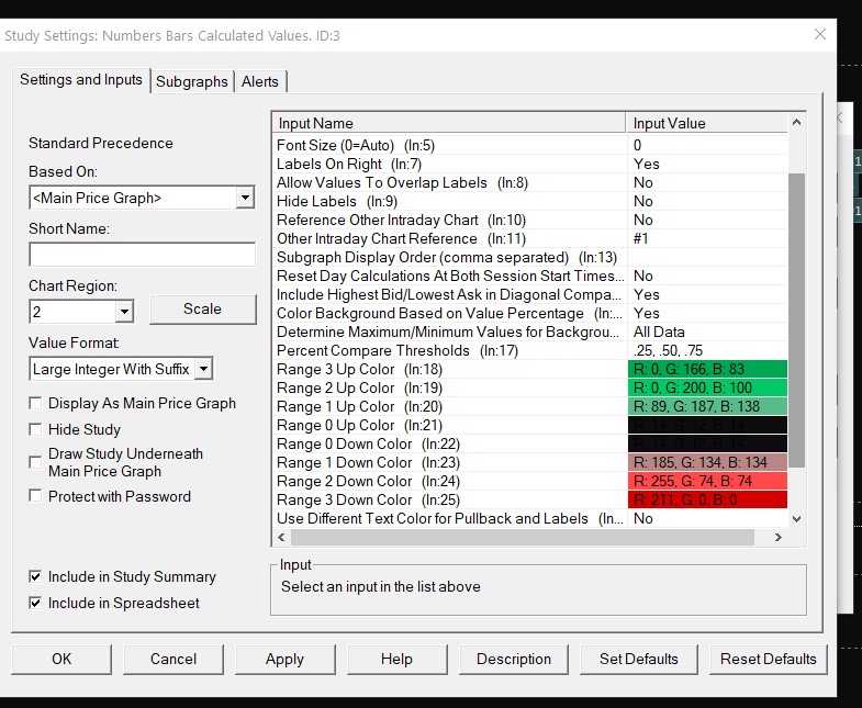
The indicator at the bottom is called Numbers Bars Calculated Values and in its Subgraphs settings, you can highlight different specifications for each bar and also color-code them by percentage thresholds.
How to set up Depth-of-Market (DOM) in Sierra Chart
To set up trading DOM in Sierra Chart you have to go to File -> Open Trading Dom
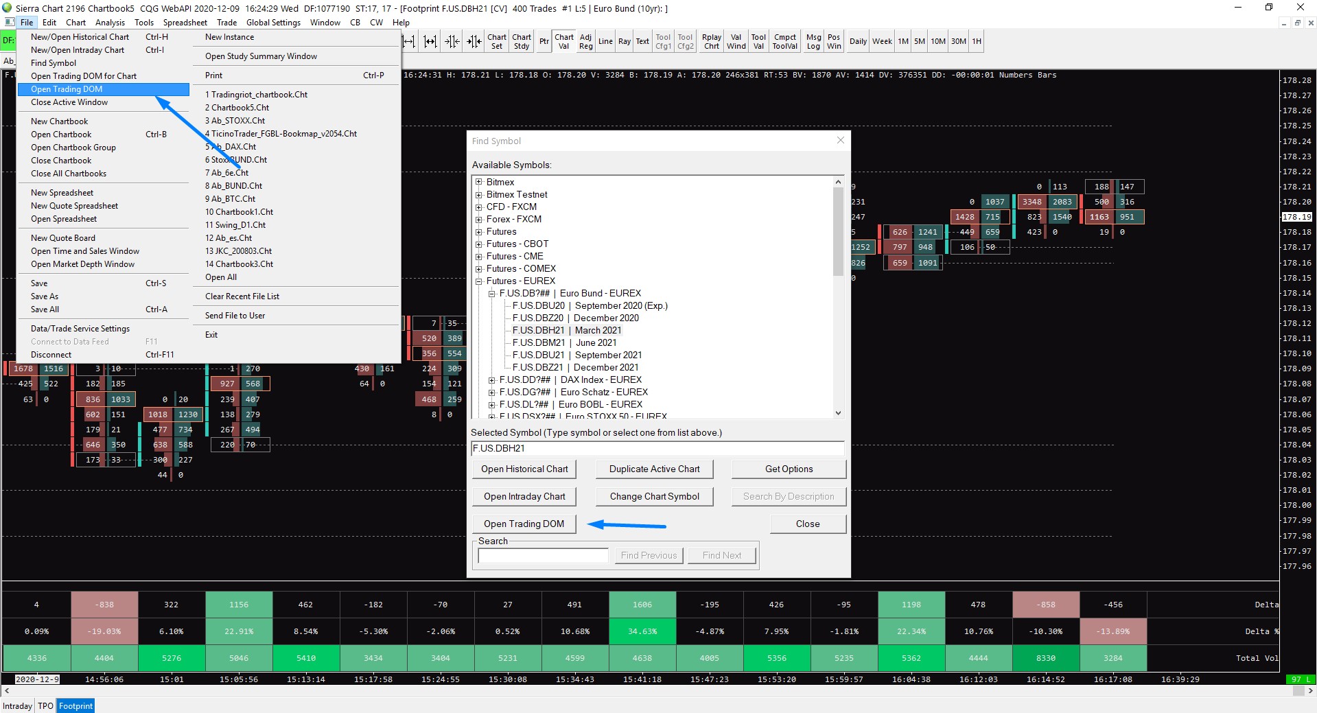
Once you do that, a new window will pop up and you will be looking at this.
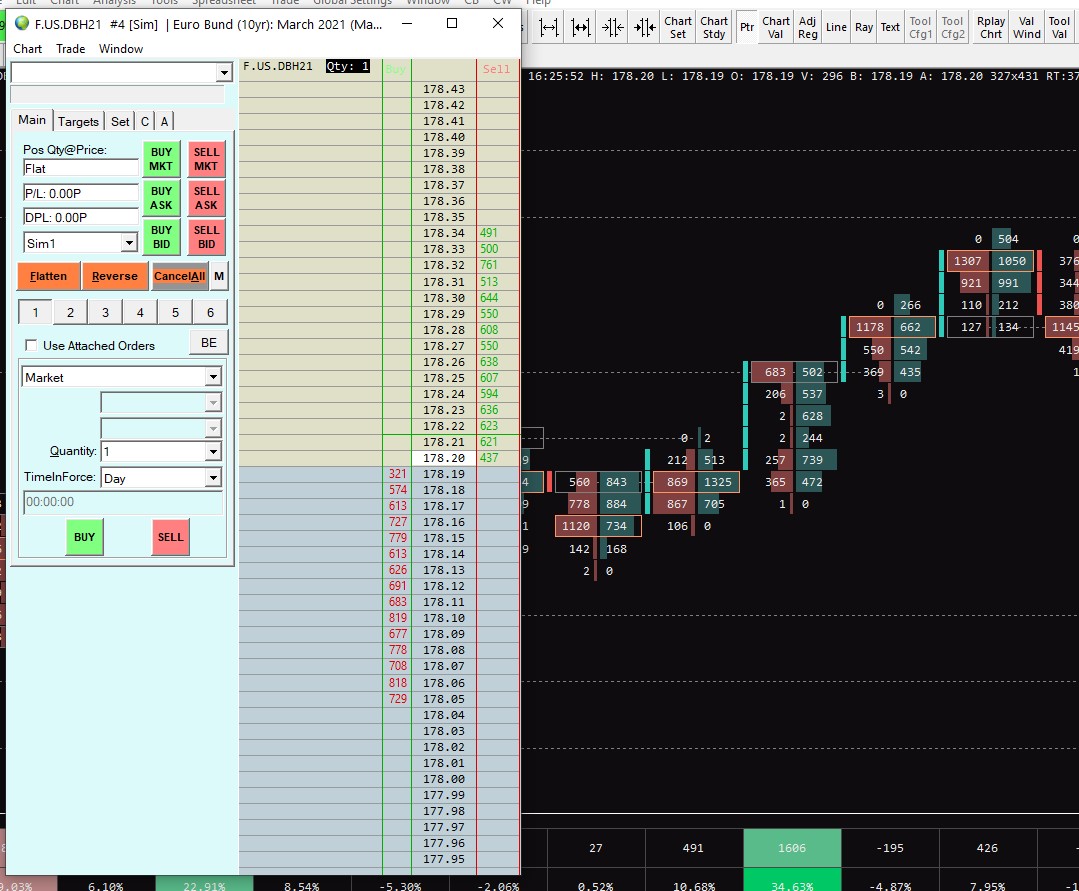
First of all, you want to go to Trade and uncheck Attach Trade Window for a chart.
Trade Window is very good and you can use it separately for a different type of brackets and order types so don’t close it, go test the features that it has.
To add more features to your DOM you want to go to Trade -> Customize Trade DOM Columns.
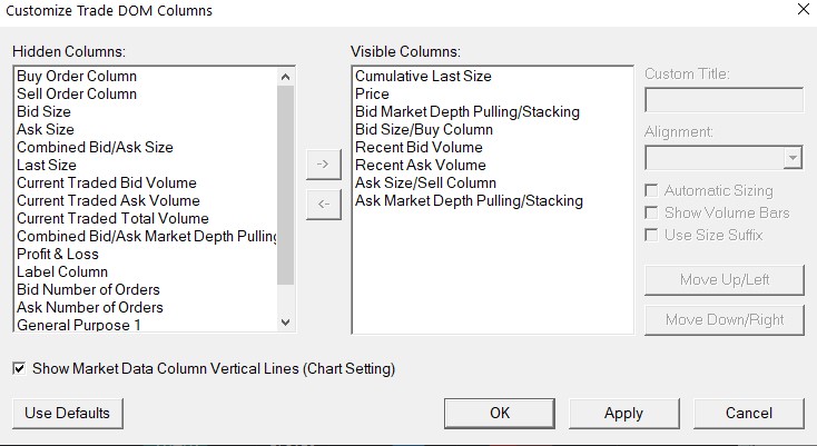
You also have to bear in mind that by clicking on Move Up/Left and Move Down/Right you change the position of these in your trading DOM.
Once you are done you can go to Global Settings -> Graphics Settings – Global and play around with your color settings, you can also add a volume profile by opening the indicators tab.
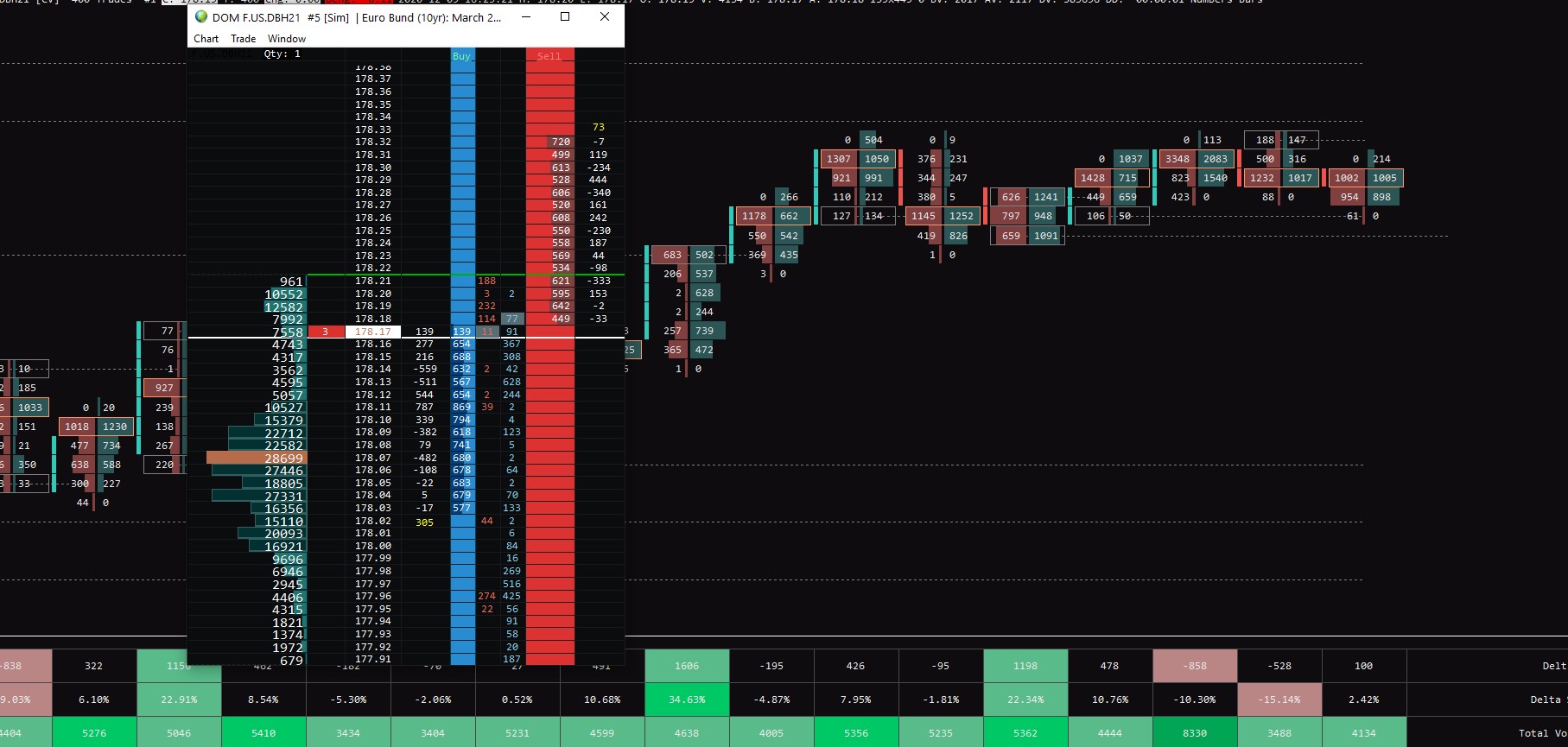
Because setting up your DOM can be quite a complex process, I recommend you to watch this video by Ticino Trader, where he shows things more in-depth.
Free Sierra Chart Chartbook
I hope you liked this Sierra Chart Tutorial.
To make things easier for you, you can download the Chartbook I made in this article for free.
All you have to do is sign-up with your email below and you will find the download link in your welcome email.
Those that are already subscribed, feel free to message me on Twitter.
Geoffrey
Great content. Could you first indicate the sierra study used in the “How to set up Volume Profile in Sierra Chart” topic. Many will not know how to navigate. I am learning a lot from your work. Thank you