
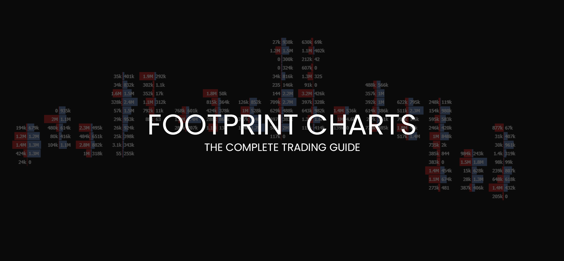
Footprint Charts – The Complete Trading Guide
Footprint charts are extremely popular amongst orderflow traders.
They essentially offer the inside look into the candles, which show the volume traded at each price.
If you are looking at the stop run, for example, on a simple candlestick chart.
You can only speculate if any participants were or were not stopped out in the wick.
But with the use of orderflow tools such as the footprint chart, we can be much more particular about this information.
In this guide, I will explain the basics of footprint charts and then show you some different ways how to use them.
If you like this article, read the rest of the blog or join the Tradingriot Bootcamp for a comprehensive video course, access to private discord and regular updates.
For those who are looking for a new place for trading crypto, make sure to check out Woo. If you register using this link and open your first trade, you will get a Tier 1 fee upgrade for the first 30 days, and we will split commissions 50/50, which means you will get 20% of all your commissions back for a lifetime. On top of that, you will receive a 20% discount for Tradingriot Bootcamp and 100% free access to Tradingriot Blueprint.
You can either read the article or watch the whole thing on youtube.
Table of Contents
Introduction to Footprint Charts
Market Delta created footprint Charts as a trademarked product in 2003.
Although they are not around anymore, as they filed for bankruptcy in February 2020, their Youtube channel is still up and filled with interesting videos and webinars.
Because of the trademark, you will find many different names such as Numbered Bars, Bid/Ask Profile, Cluster chart, etc.
Although the names will differ, the representation always remains the same.
Footprint charts show you the volume traded at a precise price level.
Compared to the Depth of Market (DOM), which shows you the advertisement in the market, the power of footprint chart relies only on the fact that only shows the orders executed in the market.
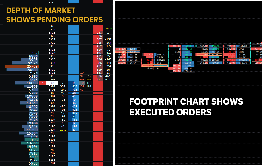
Because of that, you can extract powerful information on where buyers and sellers were interested, where absorption took place, and where did the most trading volume take place.
Compared to many different indicators that traders are using, the footprint chart is based on real-time information; therefore, it doesn’t lag.
Is trading with Footprint Charts useless?
I think before jumping into any new tool/strategy, everyone should take a deep breath and look at things with a healthy amount of scepticism.
As I already mentioned, the footprint charts offer an inside look into the market and show where participants are trapped or anticipate breakouts.
Because of that, footprint charts are a handy tool, but things differ in various markets.
As footprint charts are used in futures trading, I don’t recommend them to forex traders.
Even though you can watch currency futures pairs such as 6E (EUR/USD), 6B (GBP/USD), 6J (USD/JPY) etc.
Watching currency futures can work in theory, but since volume on spot FX is much higher, you might get misleading information.
Not only currency futures, but there is a video by Macrohedged where he explains why orderflow is useless for commodities such as Crude oil.
He says that since the volume in Crude oil is spread through different months, options, and Brent, watching one futures chart is useless because most of the big size showing on the footprint chart can be a simple hedge on another month’s contract.
Although the video is interesting, in my opinion, you can get valuable information trading commodities such as Crude oil or Gold.
With all of this being said, the best markets would be Equity Indices such as E-mini SP500. Nasdaq, Dax, Eurostoxx.
Bonds, namely German 10-yr Bund or US treasuries and Cryptocurrencies such as Bitcoin and Ethereum.
With cryptocurrencies comes another problem of different volumes from different exchanges.
As I trade mostly bitcoin these days, I look at volume coming from Bitmex, and for short-term intraday trading, the information I get from the footprint chart is very accurate.
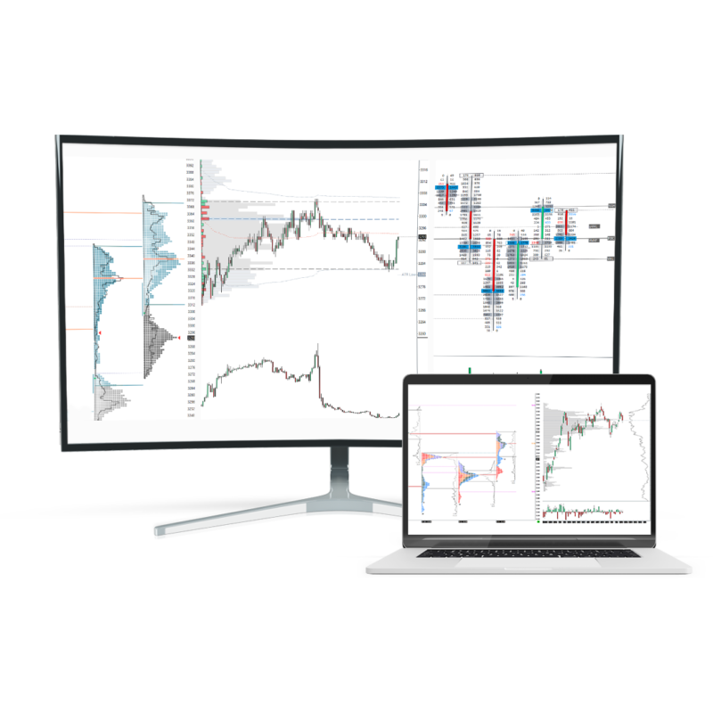
Footprint Chart Software
Before we dive deep into the footprint charts, it is probably worth mentioning that you need special software to display the data.
There are many charting software in the marketplace, and there is no need to make this a review post for one of them.
My two favourites are Sierra Chart and Exocharts for cryptocurrencies.
Because of that, all of the examples you are going to see in this article will be from one of them.
Because the purpose of this article is to give you more general information on what footprint charts are and how to read them, I am not going to dive too deep into different strategies.
If you are interested in those, you can check out my Trading Blueprint or Tradingriot Bootcamp.
How to read Footprint Charts
Footprint charts may look like an abstract at first, but they are not so hard to read.
Once you understand how to read the footprint chart correctly, you won’t trade without them.
As I already mentioned, the footprint chart lets us look inside the candle and interpret executed orders.
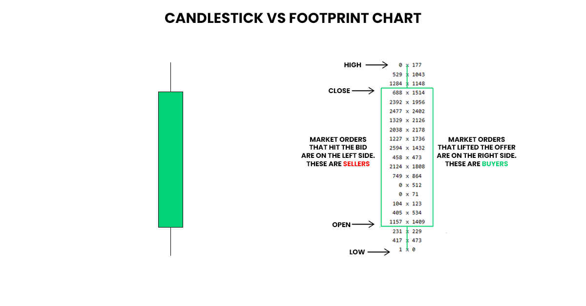
Looking at this screenshot below, you can see a clear difference between the footprint chart and a simple Japanese candlestick chart.
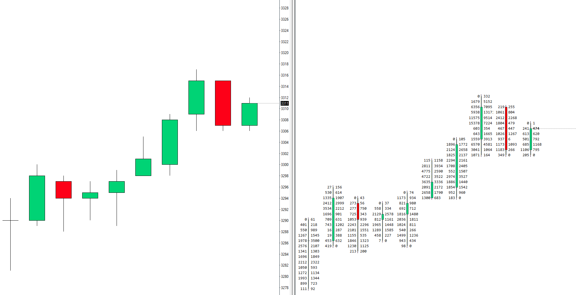
In this chart representation, we have the most commonly known footprint that displays orders executed at the bid and ask.
Bid/Ask Footprint
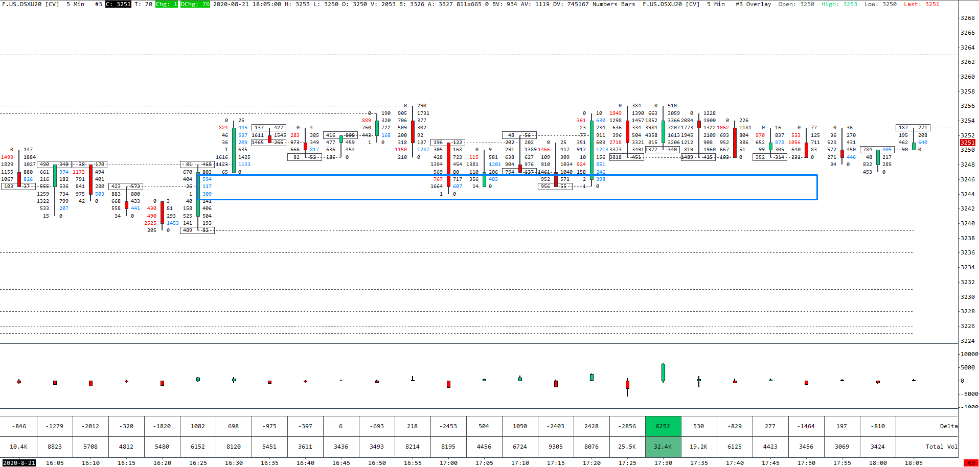
One of the most common Footprint Charts is the Bid/Ask Footprint.
Bid/Ask Footprint displays the number of contracts traded on the bid price and the number of contracts traded on the asking price in realtime for any periodicity you decide to use.
As bid/ask price change, the Bid/Ask footprint with every contract that is traded.
Bid/Ask Footprint is the most common as it was created by Market Delta first.
It is also my favourite Footprint Chart to use.
Although I like to combine it with different colouring methods, I prefer to look at Bid/Ask for numbers on the footprint charts.
Constantly changing numbers can be confusing first, but once you place them in context with other confluence factors, they become easy to read over time.
Seeing the explanation for the first time can be a little confusing. Let’s recap it.
On the left side in Bid/Ask Footprint, you have sellers because they were hitting the bid.
On the right side in Bid/Ask Footprint, you have buyers because they were lifting the offer.
I remember watching a webinar by Peter Davies from Jigsaw Trading.
In that webinar, he used an analogy of a house and going through the floor.
If you want to go up, you have to lift (the offer), and if you’re going to go down, you have to hit (the bid).
By the way, you can watch the whole webinar right here.
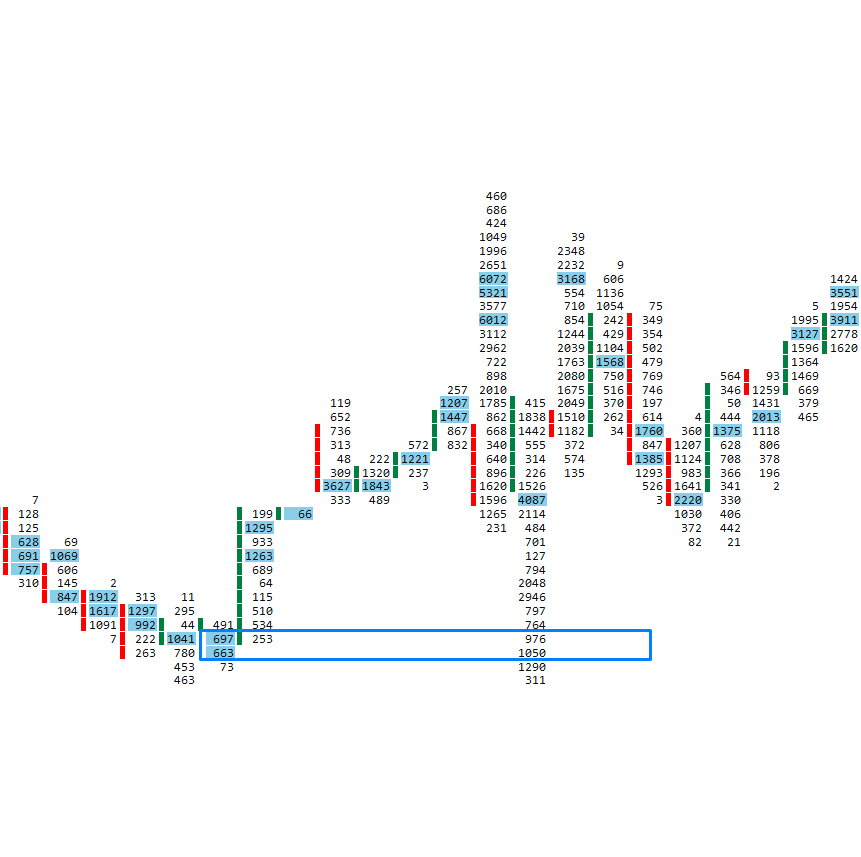
So if we have a footprint that tells us 405 x 534, 405 lots hit the bid and 534 lots lifted the offer.
Delta Footprint
Using delta in orderflow trading can be pretty complex.
Although delta’s definition remains the same, there are many different ways to interpret it in charts such as Cumulative volume delta, delta profile, or delta footprint.
For this article’s purpose, I will only cover the Delta Footprint, the others I go through in Trading Blueprint and Tradingriot Bootcamp.
First of all, you need at least a basic understanding of Delta.
As you can notice, you see only one number because Delta represents the difference between finalized executions at the bid and the offer.
Delta is an essential part of Orderflow trading because it reveals where the heavier hand was at any given candle or price level.
The best representation and calculation of Delta Footprint would be once it’s compared to the Bid/Ask Footprint.
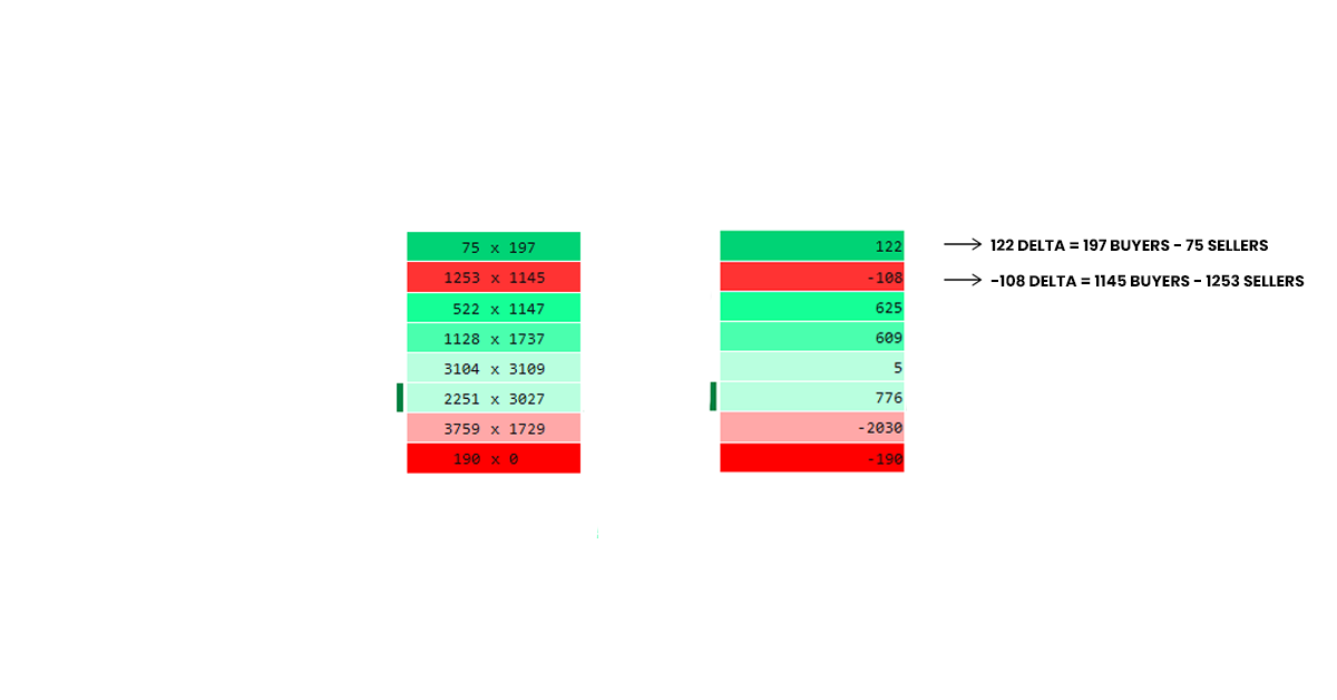
As you can see, going from top to the bottom:
First, Delta is 122. This means that 197 buyers lift the offer against 75 sellers hit the bid.
Below we have -108 Delta. That is, 1145 buyers lift the offer against 1253 sellers hit the bid.
Next is 625 Delta, which represents 1147 buyers lifting the offer against 522 sellers hitting the bid.
I hope that we do not have to go price by price, and you understand the concepts.
Delta footprint is an easy tool to show us who won the battle at each price level.
The colouring method makes it easier to recognize aggression at each price level.
So now you might be wondering if you should use Bid/Ask Footprint or Delta Footprint as they represent the same thing just a little different.
In my opinion, it is better to stick with the Bid/Ask Footprint; it is simply because the bid/ask footprint is going to reveal imbalances and finished/unfinished auctions.
I use the Bid/ask footprint to show me numbers, but it is coloured with delta bars.
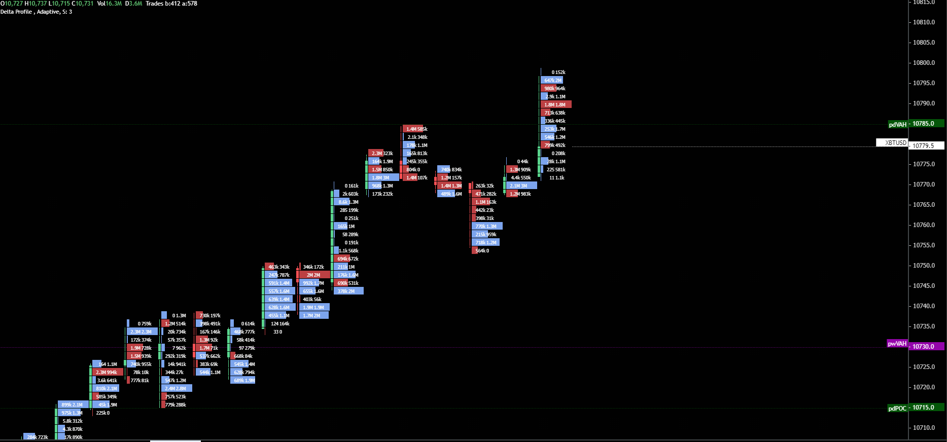
This is an example of my favourite Footprint chart setting on Exocharts.
Bid/Ask numbers coloured with Delta volume profile.
This allows me easily to spot absorption and where the heavier hand is.
If we look at the example on the chart and focus on the two highest price points at the last candlestick, there was 0 to hit the bid and 152k to lift the offer. This is a sign of a finished auction. Besides that, we have a high buying delta profile with 2M lifting the offer.
Because the candlestick has a long wick, this is a clear sign that buyers are being absorbed/trapped.
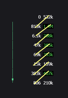
Volume Footprint
The volume profile doesn’t display positive or negative numbers.
It simply shows the total number of contracts traded at each price regardless of whether it was bid or ask.
For example, if you have a Bid/Ask Footprint showing you 400 x 800, the Volume Footprint would give you a reading of 1200 compared to Delta, which would show 400.
Volume Footprint is useful because it shows where there was and interest from both buyers and sellers.
Because large market participants like to use the same levels for stacking their orders, it is good to know where they are comfortable trading.
Volume footprint is also great for recognizing genuine breakouts based on high volume and re-using them as pockets of liquidity for future support and resistance points.
As you can see from both examples, the high-executed volume areas are re-used as support and resistance in the future.
I would recommend looking at these volume footprints for predominately price action traders, who would like to have additional confluence for their levels.
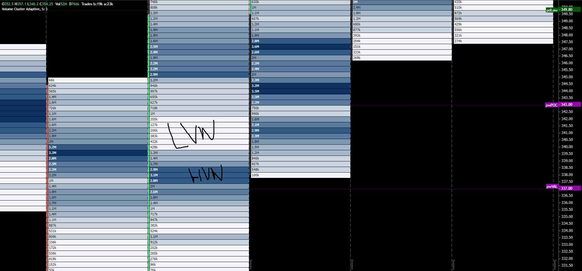
Volume Profile Footprint
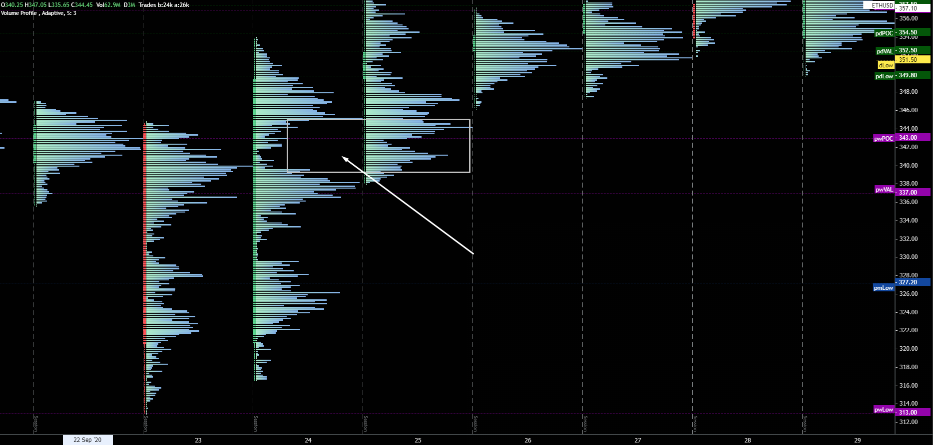
You might be familiar with the session or composite volume profile.
The Volume Profile Footprint is no different as it simply shows a volume profile for each bar at the chart.
The volume profile serves as a quick visualization of potential support/resistance areas.
Like other Volume Profiles, you are using High Volume Nodes, Low Volume Nodes, and POCs as rejection and acceptance levels.
This way, you can quickly spot inefficiencies in liquidity gaps and HVNs, which will act as support and resistance upon filling those gaps.
The chart above shows the market pushing higher but quickly turning another way once it revisits area with previously executed high volumes and filling the LVN.
I like to use these Volume Profile Footprint Charts for my higher timeframe analysis.
Putting them on a daily or weekly timeframe, you can quickly see where most volumes were traded and where we might go for filling some gaps.
As you can notice, on the 24th market rallied higher, but it left the LVN on the way up.
The next day before the continuation, we came down and filled the gap with a bounce from the HVN.
If I change the setting to the Volume footprint, which is essentially the same thing, it will look like this.
Footprint Periodicities
You can set up your chart at any periodicity you want.
Although most traders are only familiar with time-based trading, I have seen many professional traders use non-based periodicity, and they tend to look at market movements based on volume or volatility.
There are three different types of periodicity that traders are using.
| Time-Based Periodicities | Volume Based Periodicities | Volatility Based Periodicities |
| Seconds | Volume | Point-Figure |
| Minutes | Delta | Range |
| Days | Reversal | |
| Tick |
Time-Based Periodicity
Creates new bars based on different times.
This is the most popular and traditional way of looking at the price.
Because each bar represents one fixed amount of time, this is a very comfortable way of trading for many traders since all they often do is look for a candle close after a specific period.
For day trading, I don’t think this is the best way of doing things as other settings help you clean out a lot of noise and sideways action.
Volume Based Periodicity
The chart is built after the set level of volume that you specify.
There are two choices on how to interpret the volume-based footprint.
By volume or delta.
If you set your footprint to 5000 volume charts, a new bar will print out after 5000 contracts are traded.
Because 5000 contract is a relative value which is not dependent on time, there can be cases where trading 5000 contracts can take 5 minutes, but also there can be the case where build one bar will take 5 hours.
Volatility Based Periodicity
The difference between volume and volatility is that volatility-based footprint creates a movement based on the actual price movement.
Volatility filters out when the market is not moving or just trading in a very tight range.
There are a lot of different options you can choose when picking out your volatility filter.
The most popular are the tick charts, which start a new bar when a specified number of ticks occur.
Tick is defined by one single trade.
I also use tick charts for day-trading. I never experimented with others such as Range, Reversal, or Point and Figure charts.
The settings are going to be specific for volatility and liquidity of the traded instruments.
If you are wondering, here are my favourite settings for different instruments
Bitcoin – 1600 tick
ETH – 600 tick
Euro Stoxx and German Bund – 300 tick
E-mini sp500 – 3500 tick
Swing trading with footprint chart
Although a lot of traders who use order flow tend to be very short-term based.
A footprint chart can be applied to a longer-term outlook as well.
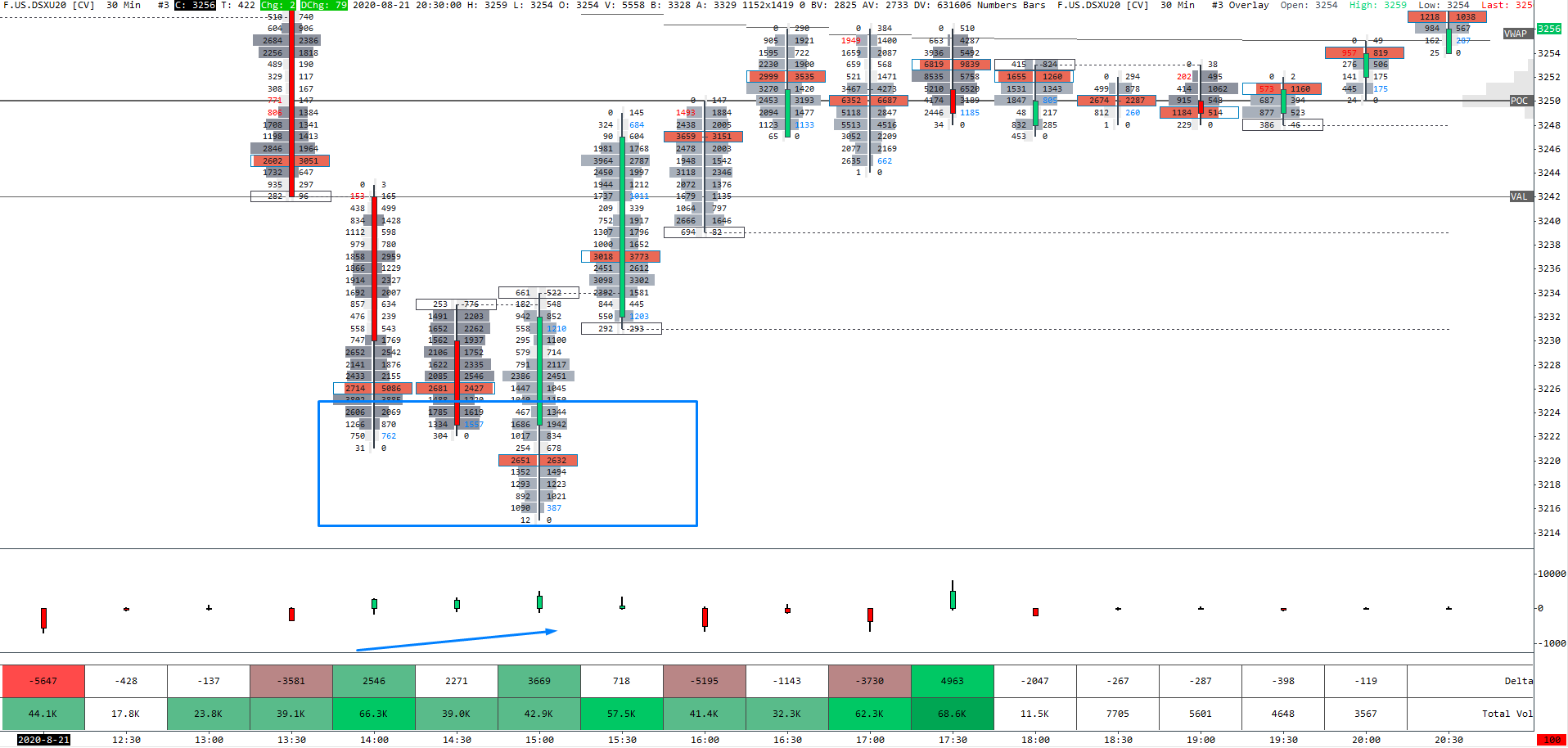
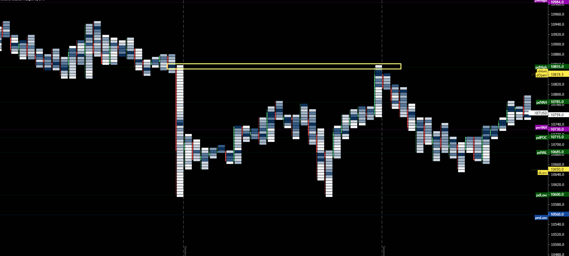
As you can notice, for example, from Eurostoxx, the market was going down on a 30-minute time-frame.
Once it was met with a level of support, buying started coming in, which we have seen on rising delta and high volume and POC built up in the candle’s wick.
You cannot get this type of information from a simple candlestick chart.
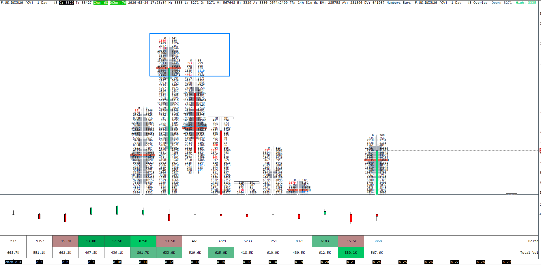
If we are going to move even to the higher time-frames, looking at the Daily chart of the same product Eurostoxx, you can see that we had a big bullish candle on the 8-12.
One hundred forty-one lots got stuck at the absolute top, and big sell imbalances were registered in the highs, combined with the area of high volumes and POC, market-tested this zone on the next day but couldn’t proceed any higher and sold-off instead.
Footprint Statistics
You might have noticed the bottom bar with numbers showing delta and volume for each bar in the last example.
The reason to pay attention to this is that you should see a rising delta for each bar in the rising market.
Same as the falling market, you should see a lower delta at each bar.
If the market starts making new highs no lower delta (or new lows at higher delta).
We can assume that no aggressive buyers are willing to push prices higher or lower.
This delta divergence can then be used for mean reversion trading.
In this example, the market trades higher on the lower delta. As this happens, it follows up with pullback.
This can be an excellent fading signal at key levels.
Footprint Trading Strategies
A footprint chart is a great tool, and I use it for my trading every day.
That being said, I never trade it without other confluence factors.
When I was trading Euro Stoxx, a very liquid market where you can get out with a few tick stop loss, I was entering based on footprint quite frequently.
In my opinion, this is only possible with these high liquid markets such as US Treasuries, Euro Stoxx, and maybe Bund or E-mini SP500, depending on current volatility.
If you are trading more jumpy markets such as cryptocurrencies, Dax, Oil, Gold, or currency futures, you will rarely nail the entries with too tight stop losses.
Because of that, I use several price action patterns with market and volume profiles to add up to my footprint chart.
The strategies I explain below are the ones I am watching every day in the market.
How I base my entries and exits, I show in the Trading Blueprint and Tradingriot Bootcamp.
Buy/Sell imbalance
Imbalances show you where the buyers overcome sellers and vice versa.
When you are looking at Buy or sell imbalance, it is compared diagonally not horizontally.
During the trading day, you are going to witness a lot of imbalances.
That is why you should pay attention only to those there are stacked together.
Using a three and more stacked imbalances show us an evident strength by buyers or sellers.
Once we identify those levels, we can use them as future support/resistance areas simply because the heavy buyers/sellers will want to hold their prices.
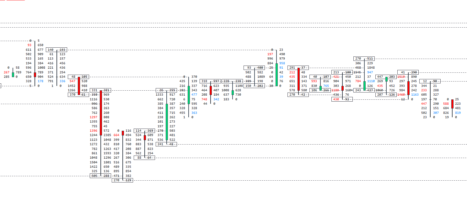
Finished/Unfinished Auction
Prices are moving up or down until they get to the point where nobody is interested in buying or selling anymore.
If markets go up, it will continue to do so until no one is interested in buying anymore.
If the market goes down, it will continue to do so until no one is interested in selling anymore.
Finished auction is made when there is a zero bid at the highs or zero offer at the lows.
It is a signal that there was simply no supply or demand in the market anymore.
The opposite goes for unfinished auction.
If there isn’t zero at the top or the bottom of the bar, it signals that the auction wasn’t finished.
As you can see, finished and unfinished auctions are not trading strategies by themselves. Still, they once again give us confirmation with more in-depth looks on how supply and demand dynamics worked at different price points.
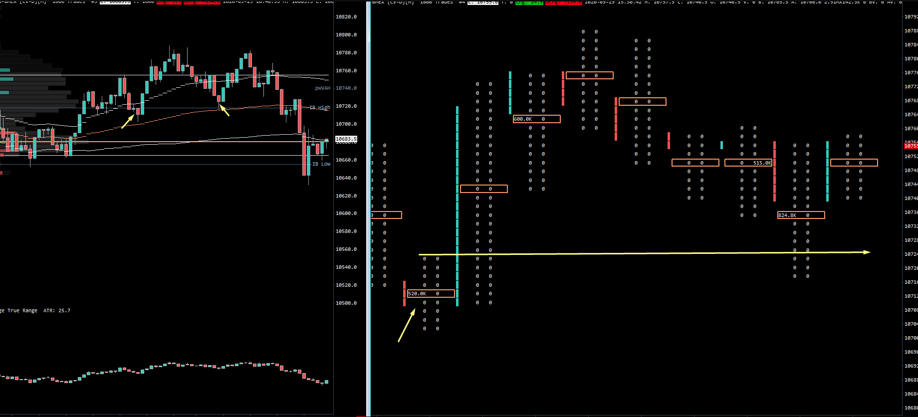
On the chart below, we see 140×193 on the left side.
This is an unfinished auction.
We can then pay attention to this levels price is pulling back.
Once it pulls back, we get 0x23, and this means the auction is finished.
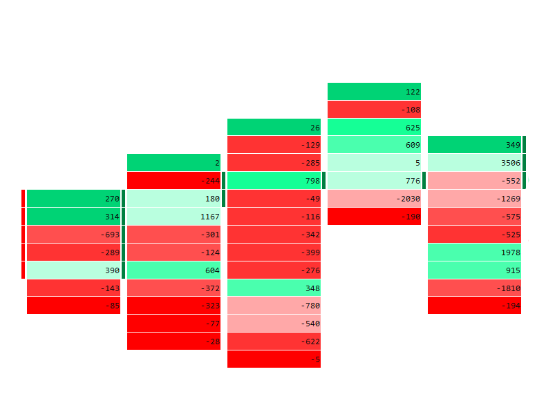
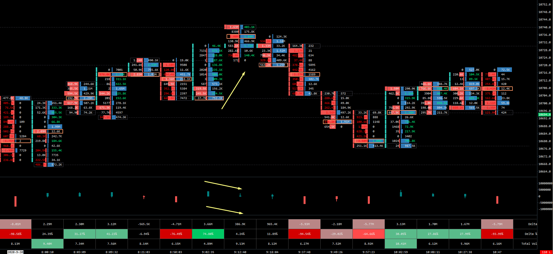
Volume Imbalance
By looking at delta or volume footprint visualization, you can get an idea where the most volume is traded.
If the market is going up, the most volume should be at the top of the bodies and vice versa for a downtrend.
Volume imbalance happens when their candle closes at the opposite side of the significant volume.
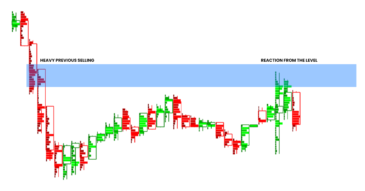
This usually means absorption, shown in the example below, as the candle’s wick at the top had high positive delta; this means buyers are trapped at the highs.

Large size tracker
What is rarely discussed in footprint trading is using filters that filter the footprint by size.
Seeing when large traders are stepping in the market is one of the most powerful confirmation of your trading idea.
In other words, if you are a one lot trader, would the fact that at the same time you are opening your position, the trader who is trading 500 lots going in with you?
Of course, it would.
This is a prime example of a long entry.
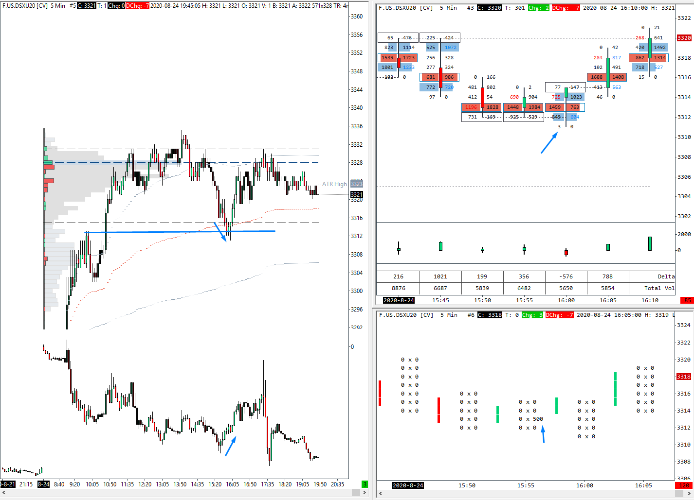
The market is testing the previous structure’s level with a delta divergence on a price action chart.
This enough could be used as a confirmation to get in a long trade.
Those that are still in doubt, on the right side, we can see two unfinished auctions followed by a finished auction with some high volume built below the market.
If that is still not enough, a large trader tracker shows us that someone executed 500 lot long entries.
As you can see, all these techniques built large confidence in execution as you are watching real-time market information instead of lagging indicators.
Example from Bitcoin with footprint chart that shows only above 500k executed.
A chart shows the seller trapped, so once the price revisits the area, he/she will likely get out for breakeven or smaller loss, which adds fuel to the upside.
Conclusion
I hope you learned something new and could see how great a tool the Footprint Chart can be.
Suppose you are a day-trader, and you are trading futures in either legacy or crypto markets, with the current age of trading when these tools become accessible and affordable. In that case, there is no reason for you not to give a Footprint chart a shot.
Stephen Connolly
Very insightful. Great content and thank you
Adam
Thanks for the comment. I am glad you liked it!
Saul
When it comes to imbalances – does one have to be mindful of at what time in the trading day these imbalances are shown – as the imbalance is always relative to the aggressive participants on the other side of the market?
Thus, an imbalance in regular tradeing hours on the ES is far more insightful than an imbalance during ETH?
Wilder Jameson
I could never understand the idea of how #of buyer & # of seller can be different at a single price point.
In order for price to go up, for example, the pending buy orders must all be filled meaning #buyers@priceA = #sellers@priceA, no?
I know that something is wrong in the above thought process, but I can’t seem to understand it for 3 years…
How can number of sellers and buyers be different at each price point?
Thanks in advance.
Adam
Hi Wilder,
One of the things that traders often think is when prices go up or down that there are more buyers or sellers.
This is not true since for every buyer there has to be a seller and vice versa.
When the price is going up or down, there is no supremacy on either side, but the amount of aggressivity or willingness to buy/sell for higher/lower prices.
I understand this might be hard to understand at first.
In the article, I linked the Webinar by Peter Davies that explains things well.
In case you missed it, here is the link – https://youtu.be/-rKhybqaNLs
Adam
Pingback: Definitive Guide to Trading Supply and Demand- Does it work? - Tradingriot.com
Pingback: Auction Market Theory - Understanding of market and orderflow dynamics - Tradingriot.com
Pingback: Market Profile Trading: The Most Comprehensive Guide - Tradingriot.com
Pingback: Trading with Volume Profile: Everything you need to know - Tradingriot.com
Pingback: Orderflow Trading: Delta vs Liquidity - Complete Strategy and Indicators Guide - Tradingriot.com
Normunds
Hi Adam,
thank you for a great post and happy new year!
I wanted to clarify a couple of things, I am still a developing trader, so please forgive me if I misunderstood this…
1) So, if the footprint only shows the market orders, then the market can only move in either direction if the limit orders can no longer absorb the aggression from the opposite side.
Example.
The market is trading at 100, and there’s a 50 contract limit sell order at 101, so in order for the market to up to 102 the aggressive buyers have to buy those 50 contracts, and demand more, so that passive seller, no longer can absorb the buying demand, correct?
2) Back to that market order example, so if there’s a 50 contract limit sell order at 101, and aggressive buyers buy 10 contracts, those 10 contracts will be shown on a footprint chart at the ask side, and there will be 40 limit sell contracts left (50-10=40), correct?
3) Most importantly…is there a way to track in real-time those limit orders (I dunno, maybe with Level III data), and understand if they may or may not absorb the other side?
I have seen situations where you have price trading in the rangebound channel, as soon as price approaches the resistance is, you see a large amount traded on the ask, strong delta, but the price reverses, and other times it breaks out and continues.
So I am kinda confused about what to look for…
Thanks
Adam
Hi Normunds,
Sorry for late reply, i missed the comment.
1/ yes, this is how you describe it, if you have any amount of contracts on bid/offer they have to be bought/sold for prices to advance.
2/ yes, those 10 contracts will be shown on the right side of the footprint as 10 lifted the offer. It is opposite of the DOM where you have asks on the right and bids on the left. Footprint shows sells on the left and buys on the right (left side are those who hit the bid and right side are those who lifted the offer.
3/ You can track what limits are doing on more advanced DOMs which show pulling/stacking or heatmaps where your clearly see size added/substracted from the book. Absorption on the DOM can be seen but it takes lot of practice. I like to look at footprint, on footprint chart you can spot a large print (huge number much bigger compared to others(, If you see large buy but price didnt move higher, it means someone on the other side absorbed it.
I hope I have answered your questions, feel free to hit me up on twitter or send me an email, I sometimes miss these blog comments.
Have a great day,
Adam
birdy num
adam, regarding his/normunds point 2, i don’t think if somebody has 50 orders on limit and a buyer buys 10 at the market, the remaining 40 will show on bid side. to be clear – only MARKET orders show on footprint right?
so if I am a seller waiting for my fill, and buy only market buys 10…unless i market SELL the remaining 40 they will not show up on footprint. if another buyer comes in and takes my 40, then they’ll show at footprint maybe at another time.
correct?
also – this article is super. you should keep writing, hard to find quality content like this.
Charles
For someone not having the bankroll to move into futures, would you say it is worth a try to read CME currency pairs and look for footprint patterns and execute in spot fx?
Great guide, thank you a lot!
Adam
Yes you can do that, I recommend looking at EUR/USD, Dax, Nasdaq or Gold
Charles
Appreciate that, Adam. Is that because they’re liquid markets? For example is S&P, Nikkei and Dow also on CME-Globex, so they would also be available on this datafeed. Just curious to hear your reasoning, then I’ll delve into this head on!
In advance, thank you so much for the work you’ve put in. I’ll definately pursue your blueprint once I get the hang if the basics.
Charles
Adam
they are actually less liquid.
if you trade more liquid markets on CFD like Euro Stoxx, Bund, or ES you have to pay spread on your CFD broker which a lot of time makes it not worth it. But on fast markets like NQ or DAX, spread doesn’t matter almost at all.
Lance Glenn Johnson
Hi Adam,
Firstly, thanks for all the great information. Its been such a great getting my head around the footprint chart.
Do you know how to filter the footprint chart by size on sierra charts?
Cheers
Lance
Adam
Hi it is in advanced chart settings in Sierra Chart.
ritchbitch
amazing content! thanks for making it free
Adam
thank you!
sho akutsu
Thank you for your beautiful explanation from the standpoint of an real trader.
Your explanation is both practical and satisfying my intellectual curiosity.
I found you know the real trading, but it’s still too difficult for me.
I’ll continue to learn from you.
Fren
Great stuff, very insightful. Is it possible to enlarge some of the pictures in the article? A little challenging to see in detail. Thanks for your work!
Testovito
Thx for article.
Fil
Thanks for the great articles on your site, almost read all of them and gained huge insights. Trying to copy your layout from the section “Swing trading with footprint chart” cause I really like the look. Could you share by any chance the studies you used, so I can try to re-build it on Sierra? Thanks in advance!
Adam
Hi, I also published an article about a tutorial on how to use Sierra Charts. There is a free chartbook for download there.
Calvin
Hi Adam, is it possible to use footprint charts for CFD’s? for example using a DAX future footprint for DAX CFD? The market structure is pretty much the same on the 5m just a slight difference in price.
Thanks
Adam
Its not since CFDs dont have transparent volume. You need to look at futures data.
jose7vkr
I did watch all Axia courses and It didnt click into my mind, same with Market Delta. Thanks Adam to condense all the staff in a way that is easy to understan. Blueprint is a must buy as well.
I can’t thank you enough for this!
Amazing work!